
by threshold | Dec 7, 2021 | Design, Digital Marketing, Marketing, Tech/Web, Thought Leadership
If you’re a property manager looking to get a real estate website up and running quickly, you may be asking yourself whether an apartment website template is the way to go. But while the industry’s leading template providers seem like an attractive solution for some apartment brands, they often present more difficulties than they solve, turning short-term expediency into long-term headaches.
People use real estate website templates because they expect them to be the easy solution. In fact, many of these template providers are also Property Management Software providers, which is appealing to property managers because it has the potential to save time and effort when integrating their PMS and their website. It’s also affordable for most budgets because it’s a one-size-fits-all approach. By relying on a template instead of a fully custom site, property managers save money for their properties. Sounds pretty sweet, right?
Unfortunately, this picture perfect scenario often fails to materialize. Where leading template providers offered to save time and effort, they often deliver further challenges and sub-par results down the road, requiring further intervention from property managers to address these challenges. Here are some of the common issues we and our clients have noticed when working with the leading real estate website template providers.
Strict Templates Make You Blend In With The Crowd
Most apartment website templates are easy to spot a mile away. That’s because most templates are built for quantity, not quality. In other words, template providers want their templates to be applicable to a wide variety of housing brands, which tends to strip away a significant amount of visual character and functionality that might clash with a subset of brands.

The result is a look and feel that is very generic, with limited flexibility to showcase your specific branding elements and key differentiators. This is especially disadvantageous if your community is part of a competitive housing market and/or offers a lot of unique amenities and features that could earn you more attention, if only you were able to show them off more easily. Instead, with hundreds of other property sites out there using the same real estate website templates, by the time your prospects find your site, there’s a good chance they’ve already run into multiple lookalike apartment websites during their housing search. That means their first impression of your community is that it’s just like all the rest. Not exactly conversion-inspiring.
You might think this is an issue with all templated apartment websites, but not all templates are made equal. In fact, many templates offer more customization options so you can showcase your brand colors, patterns, voice, and key differentiators more prominently while still keeping costs low. Some real estate website experts also combine a templated approach with the assistance of professional web designers and developers to help you fully adapt a template to suit your needs, which could suit some brands better than the bare bones approach that most templates provide. Full disclosure: Threshold is one such real estate website provider, but we’re not the only option out there delivering this hybrid approach to real estate website design. Even if you work with another real estate marketing agency, we highly recommend this hybrid approach to launching a templated apartment website.
Not All Integrations Are Made Equal
While some leading template providers offer integrations with their own property management software and basic Google Analytics without too much trouble, integrating with other software can present surprising amounts of difficulty. This can be a problem when it comes to implementing a diverse ad mix, tracking digital marketing results, and identifying optimization opportunities.
For example, while some website template providers list dozens of available integrations with leading property management software, Internet Listing Services, analytics providers, collections and billing, marketing platforms, resident screening providers, and more, the truth is that many of these integrations are complicated and fickle, requiring a savvy web developer to decode and troubleshoot. And if you’re considering a templated website, it’s probably because you wanted to keep things simple and easy rather than needing the assistance of an expert in web development for apartments.
Plus, many desired integrations are missing, including leading third-party chatbots and CRM software. This means that the average templated website may be a poor choice for teams wanting a cutting-edge web experience with the modern touch that consumers have come to expect.

“Set It And Forget It” Leads To Poor UX
Typically speaking, property managers who opt for templated apartment websites are looking to simplify their life and avoid a lot of messing around with the website backend. For these folks, the ideal that they envision might be to get the real estate website design project out of the way so that they can focus on other things and not have to worry about the website again. Sounds nice, right?
Unfortunately, this “set it and forget it” approach often leads to poor UX when it comes to apartment websites. Templates may offer a quick way to get a basic website up and running, but this short-term advantage can pale in comparison to the long-term reality of real estate website maintenance. Amenity photos, external links, and specials info soon become outdated. Integrations break, leaving ugly and confusing elements on the your website—or worse, incoming leads fall through the cracks instead of being converted into new leases. In many ways, this isn’t a unique failing of templates, it’s just a reality of website management that property managers should be aware of while forming expectations and launching a website.
In the end, “set it and forget it” never lasts as long as you hoped, because before long, you’re forced to make site updates to ensure that your website continues to provide a quality user experience that inspires confidence in your prospects and delivers all the information and functionality they need to actually convert. So the goal you aim for in your apartment website should never be to “set it and forget it.” Someone will always need to be responsible periodically for ensuring the website is continuously optimized, or at least in proper working order. With this in mind, it may be well worth your effort to opt for a more hands-on approach from the very beginning, rather than locking yourself into a template that limits your capabilities and presents challenges for the web developer(s) you work with.

by threshold | Nov 18, 2021 | Creative, Design, Marketing, Tech/Web, Thought Leadership
 Written by Heather Ford, Senior Designer & Web Developer
People love a good story. It’s been scientifically proven that when humans hear a story that they like, it can increase their levels of oxytocin, the ‘feel good’ hormone that boosts feelings of happiness, empathy and trust. Savvy marketers have been capitalizing on this for ages, creating engaging stories for brands that resonate with people and, ultimately, persuade them to open their wallets. (Super Bowl ads, anyone?) Storytelling works in marketing because, beyond the brain hormones, it gives people a way to relate to your brand on a human level. And in the digital world we live in, this has never been more important.
While print and especially video media seem the obvious choice for this sort of humanized communication, there is another, maybe counterintuitive, area that property developers and managers can take advantage of storytelling’s powerful ability to sway the hearts of their potential tenants: their real estate website.

All good design uses color, shape, flow, imagery and copy to craft a story. Beyond these things, you can consider the common ‘three-act’ structure that many stories use when laying out the structure of a webpage:
Act 1: The Set Up. This is where your audience is introduced to the main idea of the web page they are looking at. It’s the hook that makes them keep reading, so an apartment webpage hero should be visually interesting and clear in its messaging. Act 1 in a story is also when an inciting incident happens, or a thing that drives further action. In the case of web design, this can be a strong, punchy call to action.

Act 2: The Action. This is where the bulk of the plot, or in the case of property websites the detailed information, occurs. Any text or content-heavy sections of your web page, like exhaustive lists of features and finishes, should go in the middle. Once the viewer has been introduced to the main idea of the page they are on, they can decide they want the information that is below the hero section.

Act 3: The Resolution. If you’re feeling super fancy, you can also call this the ‘denouement’. At the end of your webpage, don’t just let your content fizzle out. People have made it all the way to the bottom; they deserve a satisfying conclusion to the story. Use this as an opportunity to outline how your property solves a common pain-point for renters, or create a sense of urgency and provide a clear next-step for your users, like “Apply Now!”

A single page on your property website can encompass an entire story, or a piece (a chapter, let’s call it) in an overall story you are trying to tell about your brand. Given the way people interact with web pages, scrolling is just like page flipping. Rather than jumping randomly from page-to-page, users progress through information as a linear sequence. Because of this, a story on a website has to unfold vertically, and not in small chunks that have no visual connection between them. Unlike books, there are many ways websites can enhance this to their advantage, such as:
- Using animation. Animation on a website can be used to enhance people’s attention toward important plot points (useful information, promotions, or CTAs) and shift their attention from one place to the next, allowing you to control the flow of the story.
- Stories within stories. Embedded, interactive elements and social feeds can be used to strengthen user engagement. These are natural storytelling mediums that have been proven to improve SEO because Google knows they enhance the user experience.
- Parallax scrolling. This technique allows for interesting transitions from one section on a webpage to the next and can be combined with well-crafted illustrations and diagrams to create strong storytelling.
- Video content. Good stories use what is called “indirect characterization,” which means showing rather than explicitly telling the audience something about a character. Video content is a powerful way this can be used in apartment marketing websites. You can say that you are a family-friendly property, or you can display a video hero that shows children playing and family-friendly amenities which says the same thing—if not more—to your viewers.
Storytelling in web design is much more than words and brand voice. While these are definitely important elements, it is the unique opportunities that the digital platform offers that can really enhance a real estate brand’s story and turn a really mundane experience into a compelling one that will keep your viewers at the edge of their seat.
Sources:
1 – Speaker–listener neural coupling underlies successful communication
2 – 5 Storytelling Techniques Applied to Web Design
3 – How To Start Your Story: Story Structures

by threshold | Aug 24, 2021 | Design, Digital Marketing, Marketing, Tech/Web
Digital apartment marketing experts will often say that it’s important to update your website frequently, but have you ever wondered why? We are often recommending periodic website updates to our clients, but not always for the same reason. The truth is, there are many different reasons why updating your website frequently pays off for your digital apartment marketing goals. Here’s how updating your website can boost your SEO, improve your user experience (UX), increase your online conversions, and more.
Google Will Reward You With Higher Search Rankings
Google takes a lot into account when determining where your site ranks in search results and how current your site is plays a key role in their search algorithm. Think about it: Google wants to deliver users relevant and accurate info when they search so that they keep using Google. Having updated your site recently signals that your website more likely to be up-to-date with accurate info, modern web design, and other factors that contribute to a positive user experience.
Web Standards Are Constantly Changing
If your website hasn’t been updated in several years, there’s a good chance some of the web standards you’re following have gone defunct, fallen out of vogue, or even become illegal. For example, Flash used to be the main way to display multimedia content, but now fewer operating systems are supporting it because there are better ways to accomplish what Flash was once used for. Web security guidelines and requirements are also constantly being updated.
Additionally, state, federal, and international regulations can also dictate what you must and must not have on your website. For example, nearly every website now has a pop-up of some kind prompting users to accept the use of cookies in order to use their site.
Helps You Keep Up With Apartment Marketing Trends
You may be keeping up to date with apartment marketing trends in your industry, but does your website reflect that? Planning regular website updates puts you on a schedule to audit your website for off-trend features, messaging, and design elements that can make your community seem older and less desirable. For example, it may be time to update your amenities list to reflect how people are referring to their amenities these days (e.g. dog park vs. bark park, sparkling pool vs. resort-style pool, etc.). Additionally, take a look at the functionality your competitors are including on their site: Do they have a chatbot? An online tour scheduler? Virtual tours for every floor plan? Are you less competitive in your market if you don’t have these features?

On a related note, take a look at the information your competitors are including on their websites. The recent example of COVID-19 messaging, which is now common on apartment websites, shows how important it can be to make timely website updates in order to meet the new expectations of your audience and keep up with your competitors.
Leads to More Conversions
Keeping up with or even pushing ahead of the curve goes a long way to inspiring confidence from prospects and current residents alike. Your site doesn’t have to be flashy and cutting edge, necessarily, but just having accurate information, timely specials, no broken links, and messaging that speaks to trending housing needs can ensure your property makes it from a prospect’s awareness phase to their consideration phase. Plus, residents who see their apartment community working hard to maintain consistent website functionality and provide current information will be that much more likely to renew their lease and recommend your property to others.
Best Ways to Update Your Real Estate Website Regularly
So now that we’ve established why you would want to update your website regularly, what are the best ways to go about that? It all depends on what your primary goals are and what resources you have at your disposal.
Adding a blog to your website is one of the most common ways to incorporate regular website updates into your digital marketing strategy. This isn’t just so that you can share useful information with residents and prospects, it’s also a great way to boost your on-page SEO efforts. Not only does it allow you to update your site each time you post (signaling to Google that your site is current), but it also gives you added opportunities to incorporate SEO keywords without running the risk that Google interprets your efforts as keyword stuffing because your keyword density is too high on a given page (which can actually hurt your SEO).

But while a blog is great for SEO, it isn’t the only way to update your website regularly. Consider: what do your prospects need from your website? Were there features you didn’t initially include that you could add now, like a chat bot, tour scheduler, or virtual tours? Do you have current photos or video of all your amenities and community spaces? Do your prospects have a way to view current specials? Could you benefit from adding resident reviews on your website?
In addition to these considerations, we recommend that once a year or so, you review your keyword strategy. If you’re not sure how to create a keyword strategy, check out our post on How To Do Keyword Research For Your Real Estate Website. As search trends change, you may find that you’re missing out on a lot of potential traffic from keywords you hadn’t been targeting before.
Finally, every few years, we recommend that you do a more in-depth design update. Trends change and a website can begin to look out-of-date quickly. You don’t necessarily have to overhaul your entire website design, but a few tweaks here and there can help you keep up with the times.

by threshold | Jun 1, 2021 | Creative, Design, Marketing, Tech/Web, Thought Leadership
 Written by Chelsea Friel, Graphic Designer
Designing with accessibility at the forefront has never been more important, but it can be daunting to determine whether or not your website is in compliance with regulations. In 2020 alone, over 3500 digital accessibility lawsuits were filed, including federal and state ADA lawsuits, and an estimated 56 million people in the U.S. are currently living with a disability. As we look to expand our services in the real estate and housing market, it’s paramount that we keep accessibility top of mind in our work. The goal is to improve our practices to make our designs as accessible as possible for the widest audience, and to make usability as high a priority as visual appeal.
What Does Web Accessibility Look Like?
To be frank, the word “compliance” doesn’t exactly bring to mind a font of creative flights of fancy. It usually summons images of black Arial text neatly organized on a white background, which is fine for doing your taxes but less than ideal for promoting your sparkling new multifamily property. In truth, adhering to Web Content Accessibility Guidelines (WCAG, from here on out) is pretty easy to incorporate alongside our existing design practices. WCAG ratings are ranked from A to AAA, in a sort of “good, better, best” system. If A is the rank for a solidly usable website, then AAA is the gold standard of accessibility.
Similarly to how we build successful brands that thrive in the wild, the process of establishing an accessible web presence requires some collaboration between designers, copywriters, and developers. By keeping a few helpful guidelines in mind, each team’s work contributes to a fully accessible real estate website that anyone can (and will want to) use, regardless of their level of ability.
A Helpful Guide for Accessible Design
Contrast
When establishing a color palette, high contrast is critical for usability. When considering moderate to severe visual impairment, the ideal contrast ratio is between 1 to 3 and 1 to 4.5, depending on the size and the boldness of the text. The larger and thicker the characters, the lower the ratio can be while maintaining legibility to the eye, or to a screen reader. Any important copy should be designed with the highest contrast possible to ensure greater visibility for users.

Chrome extensions such as Spectrum can help you determine how user-friendly your website is by showing you alternate versions of your website based on various visual abilities.
Alternate Indicators
On the topic of visual acuity, consider using alternate methods of establishing a hierarchy of content apart from color changes. If a piece of text changes color when a user hovers, the addition of a line under the text serves as an additional cue that the copy can be clicked or is interactive in some way. Other visual indicators can be icons, boxes, or typeface changes (such as semibold to bold or black) to indicate to the user that they’re on the right track.

Charts and graphs can also present a challenge. Apart from using distinct colors to designate a data set, one solution is to incorporate texture or patterns into the design to further differentiate the information presented to the user. Trello has a plugin that can convert graphs using color blindness–friendly patterns to help aid legibility for all users, while maintaining the overall look and feel of the design.
Alt Text & ARIA Labels
Used to describe an image when it is unavailable to the user, alt text and ARIA labels should provide as much detail as possible. Describe what’s happening in the image instead of opting for the file name or a bland categorization of the subject like “man” or “house.” For folks who use screen readers to navigate websites, this attention to image descriptions provides a much clearer idea of what is in the design and what the website is trying to convey. This can be a key factor in whether or not they pursue your property further, depending on how well you describe the photo of the premises or the neighborhood using these tags and labels.

Content and Type Hierarchy
When writing copy for a website, simpler is better. Important messages should be short and to the point, while conveying all of the essential information a user needs to know right off the bat. WCAG recommends limiting a line of text to 80 characters or fewer, and to avoid writing overly complicated or lengthy sentences. Designers and copywriters should work in tandem to draft copy that looks beautiful in the design, excites the user with its content, and can be read by as many people as possible, regardless of the tools they use to view the website.
UI and Navigation
Users of varying abilities frequently use keyboard navigation to explore websites, and care should be taken to establish a logical flow of information. Good design is obvious, and a user shouldn’t have to spend time deciphering how to move through a website to find what they need. Clean focus states, clear and easy-to-remedy error states, and concise links makes a site more accessible to all, and provides a better user experience across the board.
Designing for Everyone
Accessibility should always be as high a priority as creating a beautiful design. A visually stunning website that can only be accessed by half of our users is ultimately a design failure, and our goal should be to be as inclusive as possible in our work. As we continue to go above and beyond for our clients and our audience, normalizing accessibility practices deepens our understanding of who we serve, and provides a more inclusive space where all are welcome.
by threshold | Apr 28, 2021 | Creative, Design, Digital Marketing, Marketing, Tech/Web, Thought Leadership
 Written by Weylan Lee, Senior Graphic Designer at Threshold
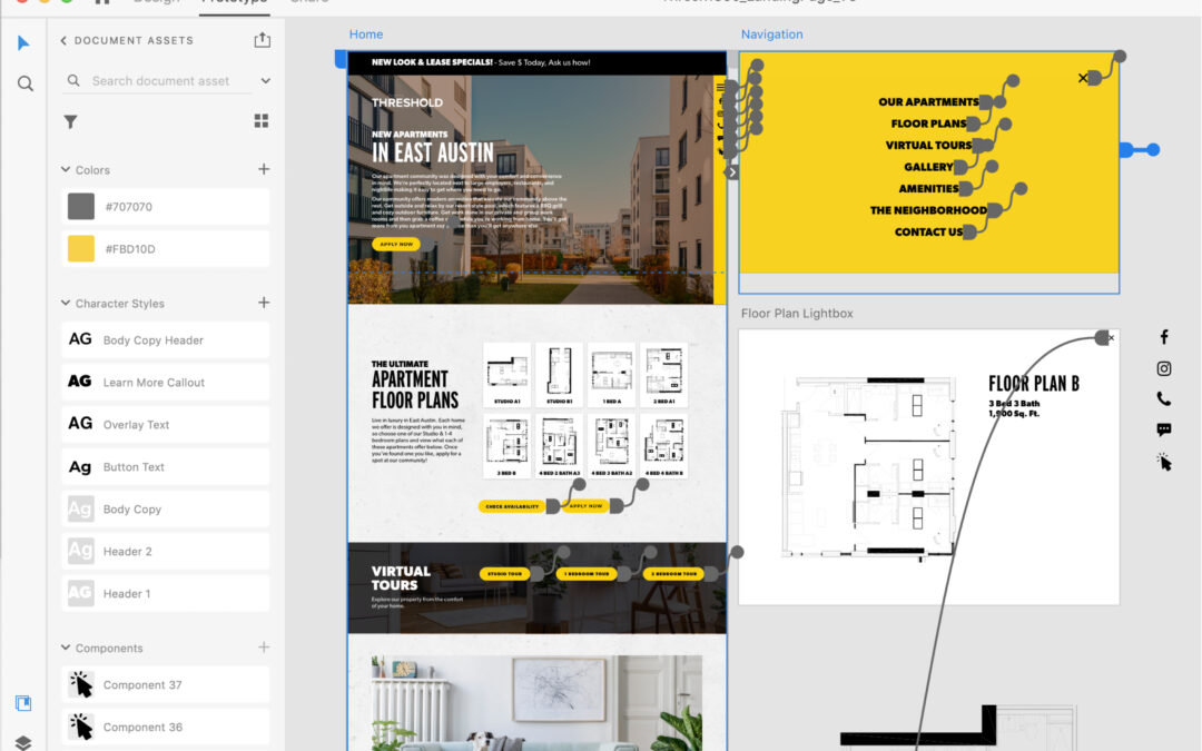
User experience and user interface (UX/UI) design are both in high demand, especially for digital spaces like apartment websites and mobile apps. With this high demand comes many tools that cater towards UX/UI design. At Threshold, we use Adobe XD, which is a design tool that allows us to create and prototype interactive experiences like websites, digital products, and mobile apps. With this tool, our teams are able to design, animate, prototype, and collaborate more efficiently, experiencing our designs just like an end user (i.e. our clients’ residents and prospects) would. This has significant advantages both for us internally as well as for our clients and their end users.
How Adobe XD Improves the Real Estate Marketing Client Experience
First and foremost, Adobe XD allows us to present our compelling and amazing website designs more comprehensively and engagingly for our clients. With XD, instead of designing static pages and leaving it to the imagination how they will animate or link to one another, we are able to incorporate engaging user experiences and interactive functionality that enhance our client’s brand and optimize for conversions from the very beginning. Our clients are able to view and experience their website designs just like a viewer would on a live website. They can scroll down a web page, click on links and buttons, interact with CTAs, as well as interact with things like galleries, floor plans, location maps, and much more. Plus, with the ability to leave comments and replies right on website designs, using Adobe XD allows our clients to make more informed decisions and provide accurate feedback, streamlining our collaboration with our clients.

How Adobe XD Improves Collaboration for Creative Real Estate Marketers
For our internal teams, using Adobe XD has allowed us to design more immersive and impactful website experiences and made our internal collaboration more efficient – which also benefits our clients! Our designers are able to experience and interact with their website designs in real-time as they are designing. This allows us to create more impactful, engaging user experiences and ensure that a website not only looks amazing and functions properly, but also provides a great experience. Adobe XD also allows for the creation of brand-specific design libraries, which our designers use to ensure that a client’s branding (fonts, colors, buttons, and more) is applied consistently throughout each page of an entire website. Even better, the collaboration tools within Adobe XD allows our designers and developers to share website assets and details more efficiently, reducing project timelines and ensuring a smoother transition between design and development.
Why You Should Work With a Real Estate Marketing Agency That Uses Adobe XD
To sum it up, by using Adobe XD, our teams are able to create impactful user experiences that our clients (and their current and future residents) will enjoy. The improved and efficient collaboration between our internal teams and our clients and project teams means that we are able to reduce project timelines and ensure we are creating the highest quality websites for our clients. Our project teams are able to spend more time on creating amazing and impactful website designs with great experiences. At the end of the day, that all leads to increased conversions and customer loyalty among our clients’ prospects and current residents.