With Active Living communities proliferating and the next generation of seniors entering retirement age, a new era of senior housing marketing is well underway. But old beliefs about seniors and their housing needs still impact how communities are developed and marketed. After all, it wasn’t long ago that “retirement homes” and “nursing homes” were considered the primary choices for seniors looking for apartment-style living options.
The misconceptions still lingering about the senior housing market don’t just influence how people outside the industry think about senior living, they also impact what senior housing developers, owners, and management firms believe about senior housing marketing best practices. That’s why we wanted to take the opportunity to explore some of the most common senior housing marketing misconceptions today. We’ll interrogate some commonly held assumptions and deconstruct them to arrive at the truth about marketing housing to seniors.
Misconception #1: All Senior Living Communities Have The Same Marketing Needs
Senior living is not a monolith, but marketing practices are still working to catch up with its modern evolutions. Today, there are many different types of senior housing communities, each with its own unique marketing needs and best practices. Active Living communities have very different marketing needs compared to Assisted Living, and Assisted Living has different needs than Memory Care. A hybrid community has different challenges still. A good senior apartment marketing plan takes the community’s unique offerings into account. This applies to strategies around branding, digital ad tactics, website design, SEO strategies, and lots more.
Some senior apartment marketing strategies (like SEO and ad targeting tactics n particular) will also differ between urban vs. suburban vs. rural communities. Further, each unique local market carries its own culture of expectations, trends, and competition. Gone are the days when seemingly all senior housing communities were out in the suburbs, away from the hubbub of city life.
These different needs also arise from different audiences across different community types. Adult children of the senior prospect often have a primary role in selecting Memory Care, for example, while the senior and other decision makers may divide responsibility for the housing decision more evenly for Assisted Living. When it comes to Active Living, adult children may assist in the housing choice, but often the senior prospect will make their decision independently. Messaging, brand voice, ad targeting, and other marketing factors should take these differences into account.
Misconception #2: Senior Apartment Marketing Needs to Be “Safe” or “Conservative”
Today’s generation of seniors (and their adult children) are just as fun-loving, bold, and free-spirited as anyone else. Marketing for seniors tends to be safe and conservative, but these tactics often verge on boring and unimaginative, which isn’t winning anyone over. In fact, avoiding the safe and conservative option in favor of the bold, out-of-the-box option can be a huge breath of fresh air for seniors who are bored of the same old, same old and looking for brands that truly resonate with their inner spirit.
Keep age in mind, but don’t be ageist when you do so. That means taking the time to think critically about what you think will resonate with your target audience and why. Take care to eschew assumptions that may stereotype seniors in condescending and inaccurate ways. Push yourself to be bold and engaging without necessarily being youthful; after all, no generation has a monopoly on fun, audacity, or spirit.
Misconception #3: Senior Housing Marketing Relies on Traditional/Print Tactics
The old practice of ignoring the digital sphere in favorite of traditional print marketing tactics no longer works for today’s senior apartment marketing audience. While this audience continues to find traditional marketing persuasive, that doesn’t mean you can neglect digital tactics entirely.
Contrary to common assumption, cutting-edge digital marketing campaigns will reach today’s generation of tech-savvy seniors and their adult children. It’s becoming essential for senior housing communities to think about SEO, website UX, virtual leasing, digital ad campaigns, and more.
Misconception #4: Senior Housing Is Only For Seniors
With age-restricted communities, it’s easy to focus on just the members of your marketing audience that fall into your resident age range. But while seniors are your residents, many seniors want to live in a community that welcomes their entire family and provides a place to share during visits. That’s why some senior housing communities feature amenities like children’s playgrounds. Keep in mind that the adult children of seniors will be a large part of your audience too, and this community will be a place they come when they visit their parent(s).
In other words, your marketing should invite your audience to imagine your community not just as an ideal place for seniors, but also for the whole family. That means family-friendly amenities, proximity to city centers and major highways, and spacious interiors with room to entertain can be well worth a shout-out on your digital ads, website design, and more.
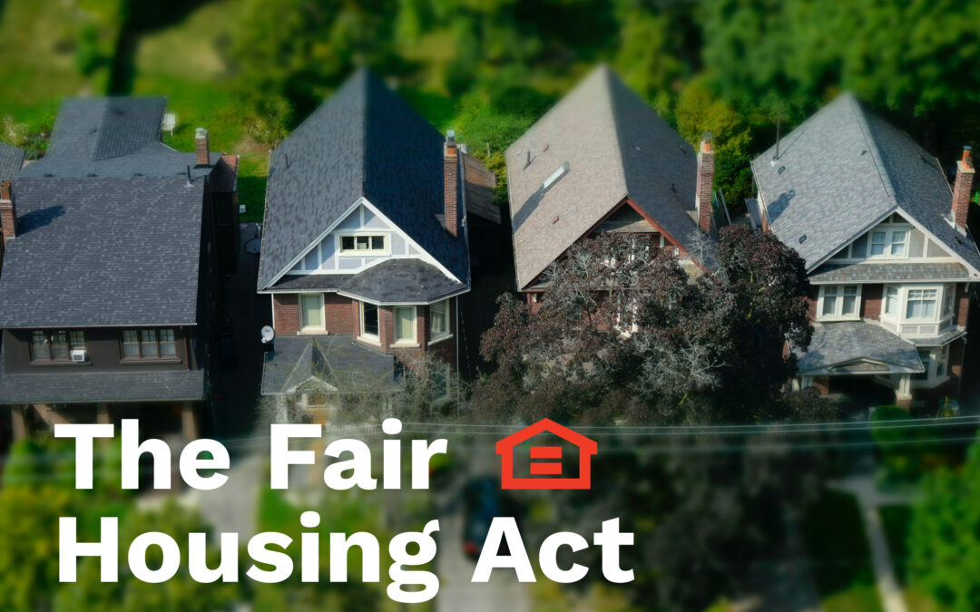
For real estate developers, leasing and property management teams, apartment marketing agencies, and in-house real estate marketers alike, fair housing requirements have been an evolving consideration when it comes to how we do our jobs. With guidelines still emerging and clarifying, especially for the digital space, this topic can sometimes feel like a moving target. Regardless, it’s essential to put in the time and attention required to understand how legislation like the Fair Housing Act (FHA) works to reduce housing inequality across factors like race, disability, and national origin.
Our goal with this article is not to replace your legal counsel, but to provide our learnings and recommendations for FHA-compliant apartment marketing that supports a more equitable housing market. Our goal is to empower you with a better understanding of how you can not only act within the guidelines of FHA law, but more importantly, how you can avoid inequitable impact toward disadvantaged groups when you market your housing to your audience. After all, inequitable impact can occur more easily than you might think, and much of it is done unintentionally. But take heart, real estate marketers; a little extra effort and consideration can go a very long way.
So let’s start by introducing the Fair Housing Act, then we’ll discuss our recommendations and action items for marketers like you.
What is the Fair Housing Act?
The Fair Housing Act prohibits the making, printing, and publishing of advertisements that indicate a preference, limitation, or discrimination because of race, color, religion, sex, disability, familial status, or national origin.
It’s designed to not only outlaw explicit housing discrimination against these protected classes of people, but also to reduce housing inequality that may be caused in unintentional or subtle ways.
Housing Inequality refers to a disparity in housing availability and quality across variables like race, class, disability, and more. Housing inequality is typically a result of systemic factors both past and present, from Red-lining to wage inequality.
Housing inequality may include…
less housing available to certain groups
less affordable housing available than demand requires
less access to local resources (e.g. schools, parks, transportation, social services) for certain groups due to where they predominantly live
and more.
History of the Fair Housing Act
The FHA is considered amongst the last major acts of the ‘60s Civil Rights Movement. It was called for by civil rights activists of the 60’s including Martin Luther King, Jr., who demanded an end to redlining and other discriminatory housing practices that were preventing many Black and Latinx people from renting in certain neighborhoods. The act had been introduced to Congress when MLK was assassinated on April 4th, 1968, increasing pressure on Congress to pass the bill. It was then passed prior to MLK’s funeral.
But the FHA didn’t end housing inequality. While it has positively impacted many Black and brown renters and homeowners, a variety of systemic factors still result in housing inequality today. For example, the FHA did little to disrupt a trend of “white flight” between 1950 to 1980, when the Black population in America’s urban centers increased from 6.1M to 15.3M. During this time, whites moved out to the suburbs, taking many of the employment opportunities Black people needed into communities where they were not welcome.
Since its initial passing, a number of amendments and provisions have expanded the language of the FHA. Notably, in 1988, Congress passed the Fair Housing Amendments Act, expanding the classes protected by the act to include disability and familial status (e.g. people currently pregnant or with children).
During the Obama administration, the AFFH (Affordably Furthering Fair Housing) provision of the FHA was introduced, which expanded both accountability and resources given to cities and regional governments receiving HUD (Dept. of Housing & Urban Development) funding. These rules and resources were designed to Affirmatively Further Fair Housing by incentivizing fair housing efforts at the governmental level. However, in 2020, the Trump administration amended this provision, rolling back most of the accountability and resources provided by the provision. This change makes it less likely for fair and affordable housing to be built, but it doesn’t ultimately impact a marketer’s responsibilities to either the FHA law or to ethical ideals.
Protected Classes Under the Fair Housing Act
Race, color, religion, sex, disability, familial status, and national origin are all protected classes under the FHA.
Many state and local laws have more expansive fair housing protections that prohibit housing discrimination based on additional protected classes, such as sexual orientation, marital status, source of income, and use of Housing Choice Vouchers.
In some cases, political affiliation may also be a protected class according to a webinar by the National Fair Housing Alliance.
Below are a few examples of who and what these protected classes cover and don’t cover.
What Counts As “Advertising” Under the Fair Housing Act
It’s important to realize that under the FHA, the definition of advertising is actually very broad. It includes…
print and online advertisements
print materials such as brochures or applications
television and radio ads
and even speech.
In other words, the FHA can cover messaging from a brand or people associated with the brand even across media that may not strictly be advertisements as typically defined. For example, expressing an illegal preference or limitation to one of your fellow agents, brokers, employees, prospective sellers, renters, or to any other person in connection with the sale or rental of your property is illegal under the FHA. Here are two examples of illegal advertising that you may not have realized were violations of the Fair Housing Act (examples provided by the Fair Housing Institute).
A maintenance man tells a passer-by that “only real Americans” live in the apartment complex where he works.
A rental office is decorated with many large pictures of the residents participating in the community’s facilities and amenities such as exercising in the weight room, swimming, and playing volleyball and tennis. However, all of the pictures are of white, young, “yuppies;” none of the pictures shows children, or persons of differing races or nationalities.
Best Practices for Fair Housing Compliant Marketing
FHA-Compliant Copywriting
When it comes to writing fair housing compliant copy for your apartment marketing materials, it’s important first and foremost to use inclusive language as often as possible. This includes the following:
Use gender-neutral terms and pronouns as often as possible. (e.g. “partner” or “spouse” instead of “husband” or “wife;” “child” or “student” instead of “son or daughter;” “they/them” instead of “he or she/him or her;” etc.)
Avoid mentioning specific religious holidays or practices
Avoid mentioning specific national or regional origins
It’s also wise to eliminate the use of buzzwords like “Restricted,” “Exclusive,” or “Limited,” as these have been associated with discriminatory practices in the past. If tempted to use these sorts of buzzwords, consider similar words instead like “Luxurious,” “Deluxe,” “Quality,” or “Sophisticated.”
It’s also important to avoid the temptation to speak about who you see as the ideal resident of your community. For example, if you have a community with a playground, you might be tempted to say that your apartments are “perfect for families,” but this expresses an illegal discrimination or preference for one of the protected classes under the FHA. Instead of indicating who you think should live at your community, focus on the amenities, features, and local attractions your property offers. Always offer truthful information about the availability, price, amenities, and features of a housing unit and leave it up to your prospects to determine whether the community is right for them.
In addition, when writing copy for websites, social media posts, articles, and the like, consider how legible the copy will be to a person reading your content via a screen reader program rather than by sight alone. Use capitalization and punctuation in ways that make it easier for these screen reader programs to parse copy (e.g. capitalize each word in a hashtag as in #ScreenReader).
FHA-Compliant Design
When it comes to design, representing diversity should be a top priority whether you’re launching new ads or designing a website. Use photos of diverse groups of people from all protected classes whenever possible. If you have to depict just one or two people in a given image, consider depicting a person or people from another protected class in the next image. In general, your goal is to provide an overall impression of diversity for a user that encounters your brand assets. Don’t forget that diversity doesn’t just include racial diversity, it also includes things like gender, disability, and religious diversity.
It’s also wise to incorporate the Equal Housing Opportunity logo in your ads and on your website. While the Fair Housing Act itself does not require the use of Equal Opportunity logo in any ad, using the logo does show your company’s commitment to fair housing compliance.
Similarly, we recommend incorporating the Americans with Disabilities Act Icon wherever relevant, such as on a floor plans or community amenities page. Several federal laws require that private and federally-assisted housing be accessible to persons with disabilities. While this icon is not required on marketing materials, it acts as further evidence of your company’s commitment to fair housing compliance and encourages people with disabilities to apply to live at your community if they see the icon on your website or other assets.
While the Americans With Disabilities Act prohibits discrimination on the basis of disability, it doesn’t provide much in the way of accessibility guidelines to determine how accessible a website is to people with various disabilities. To put it generally, everyone, including persons with disabilities, should be able to enjoy the “full and equal” use of your website; they should be able to access content, navigate your website smoothly, engage with different elements, etc.
When it comes to more concrete guidelines, U.S. courts and the Department of Justice have continually referenced the Web Content Accessibility Guidelines (WCAG) 2.0 Level AA success criteria as the standard to gauge whether websites are accessible. The WCAG 2.0 AA success criteria are comprised of 38 requirements and you can learn more at W3’s Web Content Accessibility Guidelines (WCAG) Overview. Although there is a lot here to sift through, WCAG 3.0 is scheduled for release in 2021 and is intended to be a much more inclusive set of guidelines that are easier to understand and implement.
Using an accessibility widget is a great way to cover many of the WCAG guidelines for your website. An accessibility widget is a plugin that helps users with disabilities access the site and may allow users to adjust factors like contrast and font size, use keyboard navigation or page readers, and stop animations on the site. No plugin guarantees 100% coverage of the WCAG guidelines, but nevertheless, they are a great addition to your website.
FHA’s Impact on Digital Advertising for Apartments
Thanks to guidance from the Fair Housing Act and similar legislation, the housing industry has emerged as one of the first to receive official legal guidelines for digital advertising tactics. While traditional marketing has operated under clearer legislation, the digital space has long been a legal frontier as legislators, courts, and thought leaders work to catch up.
In 2019, platforms like Facebook and Google, who represent the lion’s share of digital advertising space, began making changes to their advertising options. To summarize, the platforms have now eliminated or adjusted a number of targeting options for ads falling into the categories of housing and finance in order to bring their platforms into better accordance with FHA and similar legislation. These changes—such as the removal of zip code targeting, age targeting, and targeting based on certain interests—reduce the possibility of inequitable impact across the protected classes under the FHA. You can learn more about Facebook’s targeting changes and Google’s targeting changes in our other posts, linked here.
What We Expect To See Next For Digital Marketing
These targeting changes on Facebook and Google are likely to act as forward momentum for similar such changes in the future. We expect cookie privacy and other privacy concerns to be a large part of the discussion in the coming years. We also expect other platforms beyond Facebook and Google to begin seeing regulation (if they don’t initiate changes proactively themselves).
From apartment Facebook ads to banner ads through Google, display ads often play a central role in a real estate brand’s digital marketing mix. Since we’re a full-service apartment marketing agency here at Threshold, that means we’ve spent a lot of time perfecting our understanding of the design, messaging, and other elements that contribute to effect display ads for apartment marketing campaigns. Today, we’re passing on our must-know tips for real estate display ads.
This article will cover tips for design and messaging dos and don’ts for real estate display ads; it will NOT cover tips for how to target your ads through the various advertising platforms that support display ads (Google Ads, Facebook, Instagram, and so on). If you’re interested in a post of ad targeting tips, let us know by dropping us a line on our contact page or sending us a message on Instagram!
Keep Copy Short and Descriptive for Apartment Display Ads
When your apartment community has so much to offer, it can be challenging to keep your ad messaging short! But there are a number of reasons why it’s essential to stay brief. The primary reason is that short copy is just more effective. Users typically encounter display ads as they go about their normal online lives, and as a result, they have precious little attention to devote to your ad. Ensuring that your ad message can be parsed quickly and effortlessly is essential if you want to work within this limited attention span to reach your qualified audience and earn their clicks.
Speaking of limited attention, copy-heavy ads can crowd out more engaging elements of ad design. Data show that ads with high-quality images and video earn far more clicks and engagements than ads without these features. When you crowd your visuals with copy, you compromise the ability of the visuals to drive this performance boost.
Not only that, but the more copy you include, the less legible your message is likely to be, especially when dealing with smaller ad sizes. Keeping your message short ensures that the copy will be legible across a wide variety of devices and ad placements.
Some platforms even restrict the amount of copy you’re allowed to have on a display ad. When it comes to apartment Facebook ads, for example, apartment marketers have long been working with a restriction called the “20% rule,” which restricted the use of ad images with text on more than 20% of the image. In 2020, Facebook announced that they would be removing this rule, but still recommend that you follow the 20% guideline, as ads with less copy tend to see better results on their platform.
A Facebook display ad following the 20% rule
So, given the limited room for ad messaging, what makes for effective real estate ad copy? Most importantly, you need to provide just enough information that it’s clear what the ad is for. Remember, the user is only devoting a few seconds at most to reading your ad, so it needs to be immediately obvious what’s being advertised or you’ll lose out on the people in the audience who might actually be interested to learn more. A headline of about 3 to 5 words (or around 30 characters) is usually best. For example, “Apartments Near UMD” or “Special Rates on Austin Apartments” get to the point quickly and clearly communicate the important information that a user needs to know in order to determine if this offer is relevant to them. You have more flexibility with copy length on certain ad sizes (for example, banner ads can incorporate slightly more copy), but in general, the shorter the better, especially if you want users to click through.
As long as you’ve mastered the short and sweet headline, you may be able to drive more qualified clicks by getting as specific as you can in the space available. For example, if the ad size is large enough to accommodate it, a subheader listing the available floor plan types or a “starting at” price may be beneficial. Where a subheader isn’t possible, just be as specific as you can within the 30 characters or so you have in your headline.
Finally, for ads that feature a CTA Button, keep that short and sweet too. “Apply Now,” “Lease Today,” or “Learn More” works great for apartment display ads.
Use High-Quality, Visually-Engaging Property Photos
We already mentioned that high-quality visuals contribute to better ad results for real estate display ads. But what counts as high-quality? What photo composition elements make an ad visually engaging?
We have an entire article devoted to answering exactly that question, which you can find here. In short, the angle, lighting, and staging of the photo all make a difference, as does the color composition (more on color below). The image should also have a single, clear focal point. If the user isn’t sure where to look, they’re not going to waste time figuring it out, they’ll just scroll right past your ad.
If good photos or renderings aren’t available, lifestyle imagery may work better than using a poor-quality photo. Stock images featuring one or two smiling people who fall into your renter demographic are common options.
A retargeting ad using a lifestyle photo
Use Bold Colors and High Contrast When Designing Your Real Estate Display Ads
Use bright colors to draw consumer attention to your ad. This is especially important with call-outs and buttons, which should be contrasting colors for high visibility. This doesn’t mean your ad should be garish; a little knowledge of complementing colors can go a long way when you want to use bold colors while still being easy on the eyes. For example, if you use a photo for your banner ad with a blue sky background consider an orange button and orange action text.
Bear in mind, though, that your branding should be consistent between your display ads and the landing page the ad links to, so use brand colors as a starting point. Ensuring that your apartment’s display ads make use of your brand’s colors and fonts make the ad’s look and feel consistent with the website. This also avoids confusing users by making them think they clicked on the wrong link.
A banner ad using contrasting colors
Tailor Ad Sizes To the Type of Apartment Display Ad Campaign You’re Running
Some ad sizes statistically perform better than others, but your choice of which ad size(s) to use for your apartment display ad campaign may be more complicated than it appears at first glance. That’s because different ad sizes are better for different goals.
For example, if your goal is to maximize impressions, ads that are 300×250 or 728×90 pixels may be your best bet. However, if your goal is to earn clicks, the highest-performing ad sizes tend to be 336×280 and 300×600 pixels. Let’s break that down a little further. That means that if you’re running an awareness campaign, where impressions are a more important factor, the 300×250 and 728×90 ad sizes may suit you perfectly. However, if you’re hoping to drive immediate leasing results, you need people to actually click through. In this case, 336×280 or 300×600 may be your better choice.
A 728×90 Retargeting Banner Ad
Your best sizing choice may further vary depending on what type of campaign you’re running. For example, smaller ad sizes for retargeting campaigns may work better because the user is already somewhat familiar with your brand and the ad can help you stay top-of-mind no matter how small it is. But for new traffic or lead gen campaigns, larger ad sizes give you a better opportunity to showcase why a user should bother to learn more. The ad size you choose may also depend on the message you need to deliver. If you need more room to accommodate a longer message (say, a special rate on specific floor plans), then a 728×90 banner ad like the one pictured above may work well.
Those are all our top tips for creating effective display ads for apartment marketing campaigns! If you have more questions, don’t hesitate to reach out to our team! We’re always happy to talk digital marketing strategy.
Believe it or not, email is still one of the most effective ways to nurture leads. Though the digital landscape has evolved dramatically, folks across all age groups still use email every single day—for many, it’s the first thing they do after waking up.
Not only is email marketing a reliable way to reach your audience, it’s also a powerful strategy for relationship building with prospects and current residents alike. It particularly excels as a retargeting strategy, keeping your property top-of-mind at various stages of a prospect’s housing search or reminding a current resident of all the reasons to renew. But the best part of all is that it’s one of the most cost-effective strategies you can incorporate into your real estate marketing plan. That’s why the right email marketing strategy can make a major impact on your real estate marketing goals. Let’s talk about some of the top strategies you can employ to get better email marketing results.
Always Begin With “WIIFM”
In other words, “What’s in it for me?” Especially in our busy day-to-day lives, people need to feel confident that your email has something to offer them. If it’s a waste of their time and attention, it could do more harm than good as they form their impression of your brand. So avoid waxing poetical about your brand or providing unnecessary information. All the info you include, every link to another page, and every element of the design should provide some clear value to the user on the other end. Remember, it’s not about you, the brand, it’s about the bridge you create between your brand and the user.
Personalize Emails Whenever Possible
People appreciate a personal touch, especially when they get so many emails every day that are sent to a mass audience. Where you choose to live is one of the most personal decisions you can make, so prospects and residents shouldn’t feel like they’re just a faceless number in your leasing pipeline. When you can, personalize emails with a salutation using their first name or, if applicable, a reference to content from their previous email. Touches like these show your audience that they’re seen as individuals, even in cases where you don’t know anything about them yet.
Send Regularly, But Not Too Often
Whether you’re following up with prospects or communicating with current tenants, you need to show you care without becoming a nuisance. Bear in mind that most people get many emails every day and are likely to ignore, archive, or delete emails that arrive so often they become spammy. Sending an email once a week is typically the maximum you should aim for, while once per month is about the minimum.
There are exceptions, of course. When communicating about a time-sensitive issue like community-wide repairs and renovations or following up on a prospect’s email, don’t worry about the frequency of your sends. These should be considered ad hoc emails rather than a part of your regular email marketing cadence.
When it comes to your marketing-focused emails, planning ahead will help you ensure you’re getting the message out without sending emails so often that it becomes spammy. It will also help you plan ahead to for marketing campaigns appropriate to your seasonality. For example, you might plan a renewal campaign in the months leading up to what’s traditionally your slow season, or you might plan an email advertising holiday deals for new leases to go out in mid December.
Improve Open Rates with Better Subject Lines
Even a stellar email design can be useless if the email is never opened. The most influential factor determining whether a user opens your email is the subject line. In order to encourage email opens, it’s essential that you provide compelling info toward the beginning so that the important stuff isn’t cut off based on the size of your user’s screen and inbox layout. Other tried-and-true strategies include using a number (Save $500 By Referring a Friend), including an emoji (Immediate move-ins available on 1-bedrooms😲), including a first name (Hi, Chad, thanks for reaching out!) or posing a question (Have you seen our pet-friendly amenities?).
Improve Click-Through-Rates By Leaving Room for Curiosity
When your goal is to get users to visit a web page, it’s best to leave them guessing. Provide just enough information to entice them without providing the whole story. This way you’ll have convinced them there’s something they want on the other side, but they have to click through to get it.
For example, say you’re running a special on certain floor plans and you want to direct users to your floor plan page where they can see specials, explore floor plans, and hopefully begin an application. You might leave room for curiosity by saying something like, “Get 4 weeks FREE on select 1-Bedrooms! This and other great incentives are available for a limited time. Visit our website to learn more and see if you can snag the perfect deal for you.”
Improve Click-Through-Rates With a Clear CTA
Since the point of email marketing is typically to drive your audience toward specific actions (visiting a webpage, starting the renewal process, completing an application, scheduling a tour, etc.), it’s important to make that desired action clear. The clearest way to signal this information to your audience is through the use of Call-To-Action (CTA) buttons that stand out from the rest of the email.
Keep the copy on your CTA buttons short and to-the-point; it should be clear, when clicking, what the outcome will be (no one appreciates a bait-and-switch). For example, “Apply Now” should take users to a page where they can start an application. “See Floor Plans” should take users to your floor plans page. A “Learn More” button beneath a headline about specials should take a user to a page that contains more information about your specials. It’s pretty straightforward; just bear in mind that the goal is to match up a user’s motivation when clicking to the outcome they actually get on the other side. Otherwise, they’re likely to bounce without ever completing the desired action. And that experience may even sour them to your brand moving forward.
Make Copy Easier to Skim
Even when you have a lot to say, keeping things brief is the best way to ensure your audience actually digests the information you provide. So keep things short, whether it’s your subject line, headers, paragraphs, or CTA copy. The easier an email is to scan, the more likely your audience is to interact with that email and ultimately take the desired action instead of becoming bored or frustrated and moving on with their busy day. Other elements that can make copy more scannable is the selective use of font weight, color, and size to emphasize which parts are most important. We’ve done that in this blog post, for example.
Use Simple, Branded Email Designs
An email doesn’t have to be stunningly designed to be effective, but it should follow the basic principles of UX. That means a design that provides a clear hierarchy of information, appears legibly on all devices (more on that below), and uses a color palette that’s easy on the eyes. Your emails should also consistently use elements of your branding, including your logo, brand colors, and brand voice so that users know exactly what sort of email they’re looking at as soon as they open it, and any users who receive multiple emails from you begin constructing a consistent impression of your brand, building familiarity and hopefully even loyalty.
Since creating excellent email designs can be time-consuming, creating a number of templates can be especially useful. This way you empower your team to do more with email marketing without an exorbitant amount of work needed to make it happen day-to-day.
Use Mobile-Friendly Designs
Bear in mind that, these days, most users will be checking their email on their phone. That’s especially true during the morning and evening hours. So designing an email that looks great on desktop but terrible on a mobile device will likely result in poor click-through-rates and conversions. That’s why we recommend designing emails for mobile first instead of designing for desktop, then trying to translate that design into a mobile version.
Consider Time-of-Send
The day of the week and time of day can have a significant impact on open rates and CTR. Understand your target audience’s typical day-to-day, then schedule your email sends to go out when folks are most likely to open and click through.
There are a number of philosophies regarding the best time to send out an email. Some like to reach audiences right when they’re waking up in the morning so that their email is at the top of their inbox when they start checking emails. Others find that sending over the lunch hour or as work is wrapping up for the day to be the best time to command the attention of otherwise busy prospects. And different audiences will have different daily routines; for example, consider the different lifestyles of student versus multifamily versus senior housing residents.
The best way to select your time of send is to test the waters. A/B testing is a particularly powerful option to determine what the best time of send may be for your overall audience. Over time, you can learn what times of day result in the most opens and clicks among your audience and then send at those times moving forward.
Build Email Lists With Lead Gen Campaigns and Contact Us Forms
Collecting the email addresses of current residents is easy enough, but building an email list of prospects is harder. While it may be tempting to buy a contact list to expand your email marketing reach, this is a particularly poor strategy for apartment marketers because it mostly results in a list full of unqualified prospects who will ignore or unsubscribe from your emails. They’ll also likely report your emails as spam, which can impact the performance of your email marketing down the road.
So we recommend gathering your contacts list the old fashioned way. The primary way that apartment communities tend to collect email addresses is through contact form fills on their website, but that strategy tends to capture folks later in their buyer journey, when they’ve already entered the consideration phase. Adding other strategies that can collect email addresses from folks earlier in their journey can help bring more prospects into your lead nurturing funnel, where you really have the ability to wow them. Facebook Lead Gen campaigns are one way to capture email addresses from people who have visited your website or searched for housing, but wouldn’t necessarily have reached out to contact you.
Just don’t forget, people are used to getting lots of spam in their inbox, and may feel hesitant to give out their email address. Clearly demonstrating what’s in it for them (i.e. providing clear value) will make them more likely to go through with handing over the keys to their inbox.
Every good digital marketing plan for real estate must take into account the user experience on property websites. After all, a digital ad is only as good as the landing page it directs to, and a bad first impression can destroy your chances with a prospect. Real estate marketers today know they need to provide a great user experience on property websites, but they aren’t always sure how to improve UX or use strong UX design from the beginning.
If this sounds like you, don’t worry, we’re going to go through some UX tips for apartment websites. These tips range from quick fixes to broader strategies, but every one of them will help you build websites that meet user’s needs and encourage them to take the actions that are important for your bottom line.
Study User Behavior
First and foremost, you need to understand your users. Not just users in general, but your users; your audience’s browsing habits, goals, needs, motivators, and preferences. Each market is different and so is each person, but a few strategies can help you discover broad habits that your site should cater towards, like what information is important to your users and what device they usually use to search for housing or access your resident portal.
Conduct a Focus Group
A focus group survey can help you understand a lot about your audience. While the best focus groups require diligent survey design, the payoff can be massive.
When conducting focus groups, make sure to get as representative a sample as possible for your city, university, or age group. You might want to offer an incentive to attract more participants—for example, with a chance to win a gift card once the survey has been completed.
Avoid asking leading questions or limiting the answers your respondents can give. Keeping things open-ended is the best way to ensure you learn something you didn’t already know (or assume).
Use Scrollmaps
Scrollmaps are a tool you can use to study user behavior on a site that already exists. It shows you where users tend to linger on a page, where they tend to click, and which areas fail to hold their attention. This is a particularly useful tool if you want to identify areas for improvement on a website you’ve already built.
Scrollmaps can’t provide a full picture, however, because they don’t show you what your users would be doing if things were different. They can only show you what they are or aren’t doing right now. In other words, they’re better at identifying problems than solutions. Still, they can be a great place to start.
Study Your Google Analytics
For more insights into user behavior on already existing sites, Google Analytics is a fantastic resource. It allows you to see which pages have the highest bounce rate or lowest time spent on-page, which pages are most viewed and which are rarely seen. These insights can help you identify sections of your site that need improvement. Combined with the use of scrollmaps, this strategy can give you a lot of information about your current UX without having to ask users directly.
Consider Your Mobile User Experience
While many users’ housing searches take place primarily online, mobile phones and tablets still represent a significant portion of the traffic to your property website. In fact, a user is especially likely to encounter your property website on their phone during the discovery phase, when they’re forming their initial opinions and deciding which properties will move forward into their consideration phase. This means having a responsive website—one that’s optimized for a variety of screen sizes—is essential in making a good first impression.
If you’re not sure how to turn a website design that’s optimized for desktop into one that works on mobile, here are a few basic guidelines.
When it comes to website design for mobile:
Stack content vertically instead of horizontally
Use image carousels instead of images arranged in a grid pattern
Implement expandable elements so users can expand and collapse information as they desire
Use an expandable “hamburger” navigation menu that remains out-of-the-way when not in use
Address Long Loading Times
Nothing contributes to high bounce rates more than a slow load time. That’s because a slowly-loading page makes for a terrible user experience in a world grown accustomed to lightning-fast internet. Users just don’t have the time or patience to wait for your site to load, especially when they have other options available to them.
The best way to reduce page load times is to be aware of the common culprits—namely, video and images. When you have several large image or video files on a page, it takes much longer to load, even on the best internet available today. It’s best to keep each image or video under 500KB wherever possible.
That’s not your only option, though. Sometimes, you might need to include a large file (or several). In cases like these, you can instead defer certain elements from loading on the page until they’re needed, or until the rest of the page loads. For example, you can wait to load a video until a user scrolls to the section of the page it’s on.
Make Pages More Engaging
The longer a user spends on a page, the likelier they are to take a conversion action or become loyal to your brand. But you need to give them reasons to stick around, and that means offering a great experience while they’re there.
One of the best ways to improve website UX by making your pages more engaging is to incorporate great images and video onto as many pages as possible. Users like to have something visual to enhance their understanding of information and hold their focus.
For apartment websites, we highly recommend taking high-quality photos and video of your community and incorporating them throughout your webpages (not just on a gallery page). Virtual tours have become a must, and your homepage can be a great place to feature a professionally edited community tour video or even feature Matterports of your top floor plans.
Make Pages More Scannable
Much as website creators might want them to, users don’t read pages from start to finish. Instead, they scan pages for the information they need or content that engages their attention.
Work with user habits and not against them by making your pages easier to scan. This creates a better user experience on your property website and improves your chances of showing a user that your community is right for them.
Tips for making web pages more scannable include:
Develop a clear hierarchy of information by using header tags, consistent font and formatting styles, and visual cues that help signal separate chunks of information (like font color, font weight, background color, and other design elements).
Use headers that clearly signal the content they introduce (e.g. “Community Amenities” or “Amenities for an Active Lifestyle”).
Avoid long blocks of text. Break up text into sections of about 100 words or less.
Avoid repetition. Repetitiveness confuses the reader about where they can find the information they’re looking for. It can also seem spammy to users and search engines alike.
Use bullets or lists when you can (like we just did).
Make In-Demand Pages Accessible
Some pages are more important than others, and you want to make sure your users can easily find and use the pages they need the most (and the pages you most want them to use). For apartment websites, that’s typically your application portal, contact page, and resident portal. It might also be a page housing your virtual tour or floor plan availability. There are a few things you can do to make these in-demand pages more accessible.
Firstly, let’s talk about accessibility in terms of how easy it is to find. Use clear Call-To-Action buttons at the tops of pages—especially your homepage—to direct users to what they need and where you want them to go. You might also use borders and contrasting colors in your navigation menu or headers to make links to these pages clearer and more attractive.
Making pages more accessible also means making them easier to use for as many users as possible, including those with disabilities. For example, make sure you use fonts that are large enough for all users to read. You should also avoid using colors that provide poor contrast with one another, especially for text and CTA buttons.
Don’t Forget About Micro-Copy
“Micro-copy” refers to those small pieces of text that guide a user through your website, like the text on a CTA button or the error message they get when they fill out a form incorrectly. It’s easy to overlook the power of strategic micro-copy, but these are often high-impact areas that define the quality of a user’s experience in spite of their relatively small real estate.
Beyond their usefulness in guiding a user clearly through your website experience, micro-copy also offers a great opportunity to turn something generic into something that expresses your unique brand and really makes an impression on users. For example, the ubiquitous “Submit” button is boring and not all that descriptive. A button reading “Send My Message” or “Make Me a VIP” is more descriptive, personal, and flavorful.
Micro-copy applies to areas like CTAs and form fills but can also include hover copy to let a user know something is clickable and what will happen when they click (e.g. on an image or button), like in the below example.
Micro-copy also allows you to set expectations for what will happen when a user does something, which makes them far more likely to take the conversion actions you want them to take. For example, if you want the user to contact you to schedule a tour or start an application, including the text “We’ll read your message thoroughly and get back to you within 24 hours,” near the contact form gives a user the confidence that taking that action will lead to their desired result.
That’s all our tips for improving UX on apartment websites! If you want to learn more about UX or get professional assistance with your UX Design, you can do so by filling out our Contact Form. We’d love to hear from you.
Now more than ever, great property photos and videos are an essential piece of real estate marketing. With fewer prospects touring in person and renters looking to find all the information they need online, great photos on your property website and reputation management profiles can single-handedly make or break your property at the beginning of a prospect’s buyer journey. Not only that, but great photography is essential to building display ads that get users to click.
High-quality video has even higher potential to impact your marketing success. You probably know by now that video ads drive higher engagement and conversion rates than ads using still images. Landing pages with video are also known to increase conversions (by up to 80%) and get more organic traffic from Google. And a video tour on your website can bridge the conversion gap for potential residents even if they can’t visit in person.
So how do you create eye-catching photos and videos that do all this heavy lifting for your real estate marketing? With a few tips, it could be easier than you think.
How To Make Photos Work For You
When it comes to great photos, hiring the right photographer goes a long way (or you can have your agency partner do that for you). But whether you’re opting to hire a photographer or do it all in-house, there are a few things you can do to ensure you walk away with assets that bring your property website, Google My Business page, display ads, and social media profiles to life.
Capture All The Right Angles
Your prospects want to see as much of your community as possible and you want them to see your good side. Carefully curating your shot list will ensure you both get what you’re looking for.
First, think about what your key differentiators are and make shots that illustrate them your top priority. Do you have a state-of-the-art fitness center? Show it off! Is it your on-site staff that set you apart? A shot of the leasing office might be in order. Got a fantastic location? Bring attention to it with an exterior shot that shows your community as part of the neighborhood.
Regardless of what you’re most proud of, you should make sure prospects can find photos of as many amenities as possible, especially the apartment amenities. Folks want to know what their bathroom, kitchen, bedroom, and living room will look like at the very least.
Whether you’re capturing your fitness center, your pool, or your apartment interiors, you’ll also want to think about the photo composition. You want photos that show things from a prospect’s point of view if they were to tour in person, but you also want to capture areas with the most visual interest and striking aesthetics. In other words, shoot your kitchen from a spot that captures the island, the stainless steel oven, the modern lighting, and the custom cabinetry all in one; don’t bother with a photo that only shows the sink and the countertops or is dominated by empty spaces like floors and ceilings.
Control Your Lighting
Good lighting is absolutely essential and natural lighting is best (even for indoor shots). The best times for taking photos with natural light are a few hours after sunrise and a few hours before sunset to ensure there is plenty of light without harsh brightness or exaggerated shadows.
If taking photos where no natural light is available, make sure to turn on all the lights in the area. You may also want to bring additional light sources with you (ones specially made for photography if possible) to ensure diffuse but bright light that doesn’t result in strange shadows or overly warm or washed out photos.
Set The Stage
An empty apartment doesn’t do your property justice. Whenever possible, stage your model unit carefully and stylishly to show your prospects its full potential. That means towels hanging in the bathroom, a cute succulent on the kitchen island, a colorful rug amongst the living room furniture, and so on. Careful staging helps ensure your prospects have no barriers to imagining themselves living in your community.
How To Make Videos Work For You
From video ads to stunning homepages to informative virtual tours, high-quality video assets can do a lot of work for your apartment marketing. Again, we recommend hiring a professional videographer and/or video editor (or getting your agency partner to help). Either way, these tips and recommendations can help you get video assets that drive conversions and inspire engagement.
Film a Breathtaking Flyover
Drone footage capturing your property from the sky is a great way to capture breathtaking visuals and add a luxurious feel to your community. This option is especially effective if you have rooftop spaces, lush interior courtyards, or lofty high-rise views. Videos like these are often displayed prominently above-the-fold on a property home page, and there’s a reason for that. They result in lower bounce rates and more time spent on-site, giving prospects a higher likelihood of converting.
Create Video Ads From Still Photos
If you’d rather opt for the budget version or need a quick turnaround, you might choose to turn existing photo assets into engaging video through the power of editing. Even a simple slideshow set to pleasant music and featuring a few key messages through written copy can enhance the impact beyond that of still photos alone, making for a great video ad strategy on Facebook or YouTube. Just make sure to keep it short; the most effective video ads, according to Facebook, are between 5 and 15 seconds long.
Shoot a Video Tour
Virtual tours are a must these days, and shooting real video of one of your leasing agents or community residents showing the viewer around a model apartment is one effective way to get that done. A video tour posted prominently on the website, shared on social media, or sent out in your email marketing is a great way to provide the experience of in-person touring without the hassle or the hazards of visiting the community in person.
Get a Matterport Video
Did you know you can get a simple video tour made for you that combines still images into a virtual 3D floor plan and allows prospects to measure and explore the layout with a click of the mouse? Matterport videos are one such tool, and another great virtual tour option that you can embed on websites, post on social media, or send in emails. For more information, talk to a Threshold team member (no strings attached).
That’s it for our property photos and video tips! From coordinating shot lists to editing videos, we hope these tips can help you create assets that work for your property. If you’re looking for more advice or help getting started, we’re happy to put the full force of the Threshold team at your back! Reach out to our team to learn more about our videography and photography services, or check out our product slick.