by threshold | Oct 14, 2026 | AI, AI Marketing, Digital Marketing, General
Every few years, someone declares organic search finished. Social was going to kill it. Then voice assistants. Now it’s AI: ChatGPT, Perplexity, Gemini, and Google’s own AI Overviews answering questions before anyone clicks a link.
Here’s what’s actually happening for real estate: renters, students, and families researching senior living are still searching. They’re just searching in more places, asking longer questions, and arriving at your website further along in their decision. The communities winning right now aren’t the ones that abandoned SEO for AI. They’re the ones treating organic search and AI search as one connected system, and actually following up on the leads it produces.
This is a follow-up to some of our most-read posts. In 2020, we shared quick SEO wins for apartment marketing. In late 2024, our local SEO guide for real estate made the case for a complete Google Business Profile, active reviews, and location pages to win Google’s Local Pack. And in early 2025, we wrote that SEO and content are two sides of the same coin, and flagged that AI-powered and voice search were changing how people find content. That shift arrived faster than almost anyone expected. Here’s what’s changed and what hasn’t.
organic search is still where real estate decisions happen.
Let’s be honest about the bad news first. A randomized field study published in April 2026 found that Google’s AI Overviews cut organic clicks by about 38% on the searches where they appear, and pushed zero-click searches from 54% to 72% (Search Engine Journal). If your property blog is built on generic “what is a security deposit” posts, you’ve probably felt it.
But the damage isn’t evenly spread, and that’s the part most “SEO is dead” takes skip. One 2026 analysis of 21.7 million search impressions found informational queries lost 61% of clicks year over year, while local searches lost 18%, branded searches lost 3%, and pricing and contact pages barely moved (Visionary Marketing). Real estate lives in exactly the searches AI hurts least: local, branded, and ready-to-act.
what renters are actually doing.
The research behavior hasn’t disappeared. It’s spread out.
- search engines are still a core tool. In Apartments.com’s 2026 survey of 15,000+ U.S. renters, 35% rely on search engines, behind only listing sites (85%) and word of mouth (37%). AI chatbots came in at 5% (NAA).
- most renters are wide open. 87% don’t have a specific property in mind when they start, and the average renter researches 10 communities before seriously considering three (NAA). That’s a discovery problem, and discovery is what organic search solves.
- AI is a research layer, not the front door. J Turner Research found 45.9% of renters now use AI to research apartments, but only 5.7% started their most recent search with an AI tool (J Turner Research).
The same pattern holds across student housing and senior living. Parents comparing purpose-built student housing near campus and adult children researching memory care for a parent are asking more questions, in more places, before they ever fill out a form. Organic search is still the thread that ties those moments together.
AI search runs on organic search.
Here’s the part that should change how you think about budget: AI answers are pulled from websites that search engines already trust.
In the same 2026 analysis, 78% of AI Overview citations went to sites already ranking in Google’s organic top 10 (Visionary Marketing). In other words, AI visibility is mostly earned through organic visibility. Cut your SEO, and you don’t “move to AI.” You disappear from both.
from featured snippets to AI answers.
If this sounds familiar, it should. In 2025, we recommended clear headings, numbered lists, and concise answers to win featured snippets, plus structured data to show up in rich results. AI Overviews and chatbot answers reward the same habits. What’s changed is the stakes: a featured snippet was one box on the results page, while an AI answer may be the only thing a prospect reads before deciding which communities to call.
same foundation, two kinds of results.
Think of traditional SEO and AI optimization (AIO, sometimes called answer engine optimization or AEO) as two outputs of one system:
traditional organic search
- What the prospect sees: a ranked list of links
- What you’re competing for: a click
- What wins: relevance, authority, local signals, and technical health
- Where the lead shows up: organic search in your analytics
AI search (AIO / AEO)
- What the prospect sees: a written answer that names a few sources
- What you’re competing for: a mention or citation
- What wins: the same, plus clear, quotable answers and consistent facts across the web
- Where the lead shows up: often as branded search, direct traffic, or a phone call
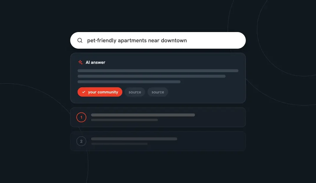
That last point matters. When a prospect asks ChatGPT for “pet-friendly apartments near downtown with a gym” and sees your community named, they may not click the citation. They search your name later, or type in your URL. The same analysis found that brands newly cited in AI Overviews saw branded search climb 23% within 30 days (Visionary Marketing). That demand is real, but it shows up looking like something else.
how the loop works.
- Your website and listings answer real prospect questions clearly and consistently.
- Strong organic rankings make you eligible for AI citations.
- AI tools mention your community while prospects compare options.
- Prospects come back through branded search, direct visits, or a call.
- They land on your site ready to act, and convert.
- You capture, follow up, and learn which content drove it, then feed that back into step 1.
Most real estate marketers have pieces of this loop. Very few have all six connected.
making SEO and AIO work together for your communities.
The fundamentals from our earlier posts still apply: local keywords and a fast, mobile-first site, a complete Google Business Profile with fresh photos and active review responses, and keyword research that matches what people actually search. That foundation is what earns organic rankings, and organic rankings are what earn AI citations. What’s changed is how you write and structure the content on top of it.
1. answer the question first.
AI tools pull short, self-contained answers. Search engines reward pages that satisfy the search quickly. Both point to the same habit: open every page section with a direct, one- or two-sentence answer, then add detail. “Yes, we’re pet friendly: up to two pets per home, no weight limit, $35 monthly pet rent” beats a paragraph about loving your furry friends.
This picks up where our voice search advice left off. We suggested writing for full, conversational questions like “What’s the best neighborhood for families in [city]?” or “affordable apartments near [landmark].” Those are exactly the kinds of prompts people now type into ChatGPT and Gemini, so build your FAQs and page sections around them.
2. get specific at the unit level.
In the Apartments.com survey, 99% of renters said unit-specific information matters, 77% want unit-specific photos, and for half of renters, missing unit photos is a deal-breaker (NAA). Specific, current details on pricing, floor plans, and availability are what both prospects and AI tools look for. Vague pages give neither anything to work with.
3. keep your facts identical everywhere.
AI tools cross-check your website, Google Business Profile, listing sites, and review platforms. If your pet policy, fees, or amenities differ across them, you look less trustworthy to algorithms and to people. Audit your community details across every profile at least quarterly. Reviews matter here too: AI tools lean on them to describe what it’s like to live somewhere, so keep encouraging residents to leave them and respond to every one, positive or negative. Our local SEO for real estate guide walks through the profile work.
4. add structured data.
Schema markup (for example, ApartmentComplex, LocalBusiness, and FAQPage) labels your content so search engines and AI tools can read it with confidence. On WordPress, most of this can be handled at the template level once and applied to every community page.
5. write for the questions your segment actually asks.
Generic “top 10 things to do in [city]” posts are the content AI absorbs fastest. Content that reflects your communities and your residents’ real decisions holds up far better. Here are the questions worth answering on your site for each segment:
- multifamily (renters comparing 10 or so communities): true monthly cost with all fees, pet policies, parking, commute times, move-in specials, and unit-level availability
- student housing (students and the parents who co-sign): walking or transit time to campus, by-the-bed vs. by-the-unit pricing, roommate matching, what’s furnished, lease start dates, and safety features
- senior living (older adults and their adult children): differences between independent living, assisted living, and memory care, what’s included in monthly fees, care level changes, staffing, touring, and move-in steps
6. track AI visibility alongside rankings.
You can’t improve what you don’t measure. Alongside keyword rankings and organic sessions, track how often AI tools mention your communities, branded search volume over time, and AI referral traffic (ChatGPT, Perplexity, Gemini, and Copilot visits are often lumped into “referral” or “direct” unless you set up a custom channel group in GA4).
if you’re not managing your organic leads, you’re missing out.
Here’s the uncomfortable truth: for many communities, the biggest organic search problem isn’t traffic. It’s what happens after someone raises their hand.
Organic leads are some of the most valuable you’ll get. You didn’t pay per click for them. They found you on their own, often after comparing you against competitors in Google, an ILS, and an AI tool. By the time they fill out your form or call, they’ve done their homework. Then too many of them wait. In 2025, we wrote that SEO isn’t just about bringing people to your site, it’s about guiding them to take action. The other half of that equation is your team acting back, fast.
the follow-up gap is real.
- a 2024 secret-shopper study by real estate analyst Mike DelPrete found 47% of online residential real estate inquiries got no response at all. The ones that did waited an average of 8 hours and 17 minutes.
- the MIT / InsideSales.com Lead Response Management Study found that responding within five minutes instead of 30 made reaching a prospect roughly 100 times more likely, and qualifying them 21 times more likely.
- Harvard Business Review found the average business took 42 hours to respond to an online lead, while those that responded within an hour were about seven times more likely to qualify it.
(All three studies as summarized in LetHub’s State of Residential Leasing 2026.)
A vacant unit costs roughly a month’s rent for every month it sits. A slow reply to an organic lead isn’t a minor service issue. It’s a leasing loss you paid to create.
where organic leads usually leak.
- the generic inbox. Website forms land in a shared email address that the leasing team checks between tours.
- no source tracking. Organic leads get lumped in with ILS and paid leads, so nobody knows which pages or searches actually produce leases.
- after-hours silence. Prospects research at night and on weekends. A next-morning reply is often too late.
- no nurture for long decisions. Senior living decisions can take months. Student housing often leases a year ahead. A single follow-up email doesn’t cover that window.
- AI influence goes uncounted. A prospect who found you through ChatGPT often shows up as “direct” or branded search, so the channel looks smaller than it is.
what managing organic leads actually looks like.
- capture every lead in a CRM, not an inbox, with the source and landing page attached automatically.
- respond in minutes, around the clock, with an instant, useful acknowledgment and clear routing to the right person or community.
- nurture by segment and stage. A parent of an incoming freshman needs different follow-up than a renter whose lease ends next month, or a family touring memory care.
- ask how they found you, and include “AI assistant (ChatGPT, Gemini, etc.)” as an option, so AI-influenced demand stops hiding.
- close the loop from organic visit to lead to tour to lease, then use what you learn to decide which content to create or update next.
This is where SEO and AIO stop being “marketing projects” and start being revenue. The visibility work earns the lead. Lead management turns it into a signed lease.
your organic search checklist.
Use this list to see where your communities stand:
- our community pages rank for local, high-intent searches (“[city] apartments,” “student housing near [university],” “assisted living in [city]”)
- every key page section opens with a clear, direct answer
- unit-level pricing, photos, floor plans, and availability are current
- our details match across our website, Google Business Profile, listing sites, and review platforms
- schema markup is in place on community and FAQ pages
- we know whether AI tools mention our communities, and for which questions
- organic leads go straight into a CRM with their source attached
- every new lead gets a response within minutes, including after hours
- we have segment-specific nurture for longer decisions
- we can trace organic visits all the way to signed leases
see how visible you are in AI search.
Talk with our team about building an SEO, AIO, and lead management program that turns search visibility into leases.
sources.
by threshold | Oct 1, 2026 | Digital Marketing, General, Thought Leadership
 Laura Robbins, Corporate Marketing Manager
key takeaways.
- The gap between click and lease is the stretch of the leasing funnel no one owns: what happens after a prospect clicks an ad and before they sign a lease.
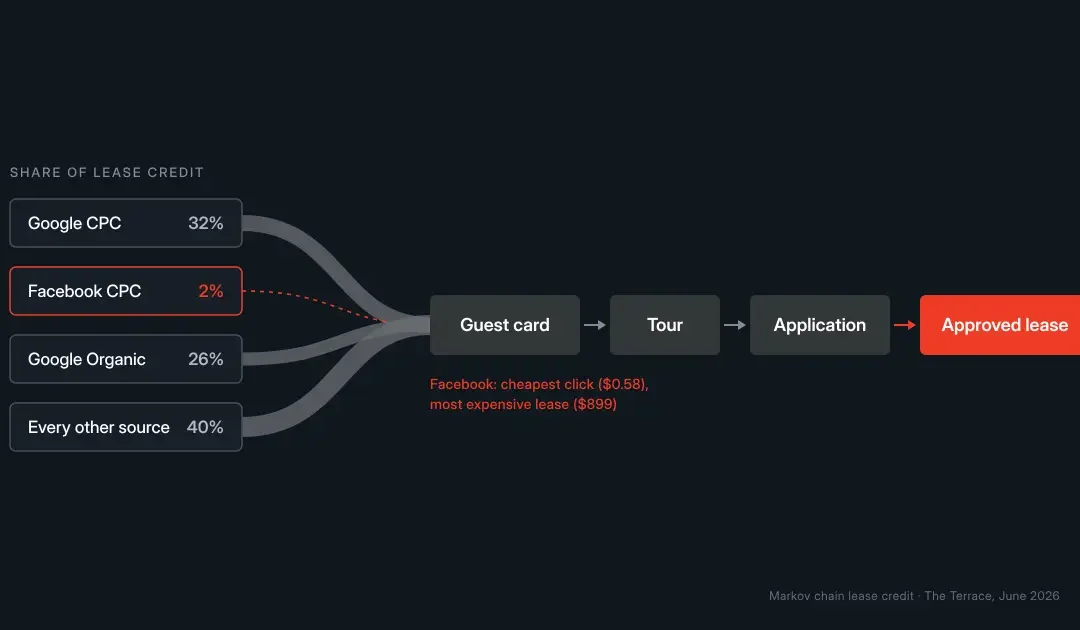
- At The Terrace, an apartment community Threshold tracked in June 2026, Facebook had the cheapest clicks ($0.58) but the most expensive leases ($899 per approved lease). Google search cost $3.75 per click and $500 per lease.
- Most marketing reports stop at the lead, so budget decisions get made on cost per click instead of cost per lease.
- Closing the gap usually means reallocating the budget you already have, not spending more.
Marketing rarely fails loudly. It leaks, and most reports can’t see where.
At The Terrace, Facebook delivered the cheapest clicks on the board: $0.58 each, about 6.5× cheaper than Google search. When Threshold followed those clicks all the way to signed leases, Facebook turned out to be the most expensive channel the property paid for: $899 per approved lease, compared with $500 for Google.
A report that stopped at clicks would have called Facebook the best deal going.
what is the gap between click and lease?
The gap between click and lease is everything that happens between a prospect clicking an ad and signing a lease: the landing page, the guest card, the tour, the application, and the approval. It’s where most leasing budgets leak, because no single team owns it and no standard report measures it.
Property marketing is usually split across three teams:
- Digital teams own reach, targeting, and cost per click
- Website teams own design, floor plans, photos, and content
- Leasing teams own the tour, the application, and the lease
Each one can be “working.” Together, they often aren’t. Ad platforms know who clicked. The property management system knows who signed. Nothing connects the two.
why do good property websites still underperform?
Property websites underperform when they aren’t built for the campaigns driving traffic. A site can have professional photography, virtual tours, and fast load times and still lose prospects because the page doesn’t match what earned the click.
Common examples in multifamily, student housing and senior living:
- An ad for a move-in special lands on a homepage where the special is nowhere in sight
- A search for a pet-friendly two-bedroom lands on a generic floor plans page
- A student housing pre-leasing campaign lands on a page that doesn’t show which floor plans are still available
- In senior living, the adult child doing the research lands on content written only for the resident
- Scheduling a tour takes several clicks, a form, and a callback
Nothing feels wrong, but nothing pulls the prospect forward either. A prospect with three other properties open in other tabs doesn’t wait to be pulled.
why is the click the most expensive moment in leasing?
The click is the moment when a prospect’s intent is clearest, their expectations are highest, and their attention is shortest. If the landing page doesn’t immediately confirm they’re in the right place and make the next step obvious, momentum is lost, and the prospect returns to a listing site.
The next step should be unmistakable: check availability, schedule a tour, or submit a guest card. No amount of bid optimization upstream can win back a prospect who left at this point.
why can’t most marketing reports see the gap?
Most marketing reports stop at the lead. They show clicks, cost per click, and sometimes guest cards, but not which guest cards became tours, applications, or signed leases, because that data lives in the property management system. As a result, budget goes to the channels with the cheapest clicks, not the cheapest leases.
When Threshold connected website analytics, ad platform data, and Entrata (The Terrace’s property management system) for June 2026, the full funnel looked like this:
- 7,001 website visits
- 161 guest cards (2.9% of website users)
- 35 approved leases (about 1 in 5 guest cards)
- $179 in blended ad spend per approved lease
Channel by channel, the picture changed:
- Organic search earned 25.8% of lease credit on $0 in ad spend.
- Listing sites earned 11.5% of lease credit (Apartment Guide 6.0%, CoStar 5.5%), a figure you can now weigh against their commissions.
- ChatGPT already appeared as a lead source, earning 1.5% of lead credit, tied with Bing.
None of that is visible in a report that ends at the click.
what is click-to-lease attribution?
Click-to-lease attribution tracks every prospect from their first website visit through guest card, tour, application, and approved lease, then credits each marketing channel for its role in producing signed leases. It connects ad platforms, website analytics, and the property management system into one report, so cost per lease can be calculated channel by channel.
Threshold’s model uses Markov chain attribution, which works in three steps:
- Map every path: chart each route prospects took from first click to signed lease.
- Remove a channel: take one channel out of the map and recalculate the odds of conversion.
- Measure the drop: the leases that disappear are that channel’s credit.
Unlike last-click attribution, this credits every touchpoint for what it contributed, not just the final one.
why doesn’t more optimization fix the problem?
Optimizing one channel can’t fix a broken handoff between channels. When digital, website, and leasing data aren’t connected, teams tune the part they own while the gap between them stays open.
That shows up as:
- Channels that look cheap getting more budget, even when they don’t sign leases
- Landing page fixes waiting in a queue behind other priorities
- Learning loops stretching from days to months
Performance plateaus. The team is capable, but no one can see the whole system.
how do you close the gap between click and lease?
You close the gap by running digital, website, and leasing as one system, measured against signed leases instead of clicks. In practice:
- Campaign intent shapes the landing experience, so the special in the ad is the first thing on the page
- The next step is obvious: check availability, schedule a tour, apply
- Every channel is measured to the signed lease, not the click
- Budget follows leases, not traffic
- Insights arrive in days, not quarters
Most importantly, someone owns the outcome (occupancy), not just a channel.
does closing the gap require more ad spend?
No. Closing the gap usually means reallocating existing budget, not increasing it. At The Terrace, the biggest opportunity was moving dollars from the channel with the cheapest clicks (Facebook) to the channel with the cheapest leases (Google search), and protecting the organic search that was signing leases for free.
Same budget, pointed at what actually fills units.
the takeaway.
If your campaigns are driving traffic but not move-ins, the problem may not be targeting, creative, or budget. It may be that no one owns the gap between click and lease, or can even see it.
Close that gap, and occupancy tends to follow.
frequently asked questions.
What’s the difference between cost per click and cost per lease?
Cost per click is ad spend divided by clicks. Cost per lease is ad spend divided by the approved leases a channel is credited with. The two can point in opposite directions: at The Terrace, Facebook was 6.5× cheaper per click than Google but 1.8× more expensive per lease.
Why would the cheapest click produce the most expensive lease?
Low-cost clicks often come from prospects with lower intent. They browse but rarely submit a guest card, tour or apply. A channel can drive lots of cheap traffic and still contribute very few signed leases.
What data does click-to-lease attribution use?
It uses data most properties already have: website analytics for sessions and sources, ad platforms for spend and clicks, and the property management system (such as Entrata) for guest cards, applications, and approved leases.
Are listing sites (ILSs) worth their commissions?
It depends on how many leases they produce. Click-to-lease attribution shows each listing site’s share of lease credit, which you can compare directly against the commission it charges. At The Terrace, listing sites earned 11.5% of lease credit in June 2026.
Is ChatGPT sending prospects to apartment websites?
Yes. At The Terrace, ChatGPT earned 1.5% of lead credit in June 2026, the same share as Bing. Attribution reporting makes it possible to spot new channels like this the month they appear.
Does this apply to student housing and senior living?
Yes. The funnel stages and names differ (pre-leasing in student housing, move-ins and family decision-makers in senior living), but the gap is the same: what happens between the click and the signed lease is rarely owned or measured.
by threshold | Sep 15, 2026 | Digital Marketing, General, Tech/Web
Order a coffee before you’ve walked in the door. Book a flight in three taps. Buy a car without ever setting foot on a lot. The common thread across every industry we work in is a shrinking tolerance for friction. Prospects have decided that steps are optional, and they’re taking their attention to whoever agrees.
Real estate — multifamily, student housing, senior living — is not exempt from this shift. If anything, the industry is more exposed to it than most, because leasing has historically been built on steps: contact forms, callbacks, in-person tours, “someone will reach out within 24 hours.” Every one of those steps used to signal a serious, high-touch process. Today, each one is a chance for a prospect to close the tab and check out the next community on their list.
the new baseline is a few clicks to a decision.
For years, the industry treated “having a website with photos and a contact form” as the finish line. But putting a floor plan online doesn’t remove friction if a prospect still has to fill out a form, wait for a callback, schedule a tour, and wait again before they know availability or pricing. That’s still a multi-day process. It’s just a digital front door on the same long hallway.
The communities pulling ahead aren’t necessarily the ones with the flashiest renderings. They’re the ones that looked at their existing leasing journey and asked a harder question: which of these steps actually needs a human before the prospect can act? Real-time availability instead of “call for pricing.” Self-scheduled tours instead of waiting on a leasing agent’s callback. One application instead of a PDF to download, print, scan, and email back.
why this matters more in real estate than most industries.
A retailer can win back an abandoned cart with a discount code. A leasing team rarely gets that second chance. A prospect who bails on a lengthy inquiry form doesn’t usually come back to finish it. They move on to the next listing, often literally in the next open tab. And with student housing and senior living in particular, decision windows are short and compressed around a season, so every extra step can cost the whole cycle.
Convenience is also doing double duty here: a community that makes touring and applying effortless is, whether it intends to or not, making a statement about what living there will actually be like day to day.
where to start looking for steps to cut.
You don’t need a full platform overhaul to make progress. A few places worth auditing first:
- Inquiry forms. Every field you ask for before a prospect gets any real information back is a tax on their patience. Which fields could wait until after they’ve seen pricing or availability?
- Tour scheduling. Anywhere a prospect has to wait for a callback to book a tour is a step they don’t control. Prospects increasingly won’t wait on steps they can’t control.
- Pricing and availability visibility. “Contact us for pricing” reads as a step now, not as exclusivity. Every day a floor plan’s real price is hidden is a day a prospect can’t move forward without you.
- Application handoffs. Any place a prospect has to re-enter information they already gave you, moving from a tour request to an application, for example, is a step you’re asking them to take twice.
fewer steps is a positioning strategy.
It’s tempting to file “reduce friction” under website or ops improvements and move on. But for communities competing for the same pool of prospects across multiple listing sites, ease of the process is becoming a message worth marketing directly, right alongside amenities and location. The communities that can credibly say “you can tour and apply here in one visit” are turning an operational decision into a competitive claim.
Threshold works with multifamily, student housing, and senior living communities to close the gap between what prospects expect and what their leasing journey actually delivers. Fom the marketing that gets someone to click, to the process after they do. If you’re evaluating where you’re losing prospects to friction, we’re happy to talk through it.
by threshold | Aug 27, 2026 | Digital Marketing, Financial Marketing, General
Privacy changes have changed the retargeting playbook. For multifamily teams and community banks, the right answer is not chasing third-party cookies. It’s building a first-party data strategy that ties digital touchpoints to physical promo fulfillment and CRM activation. Here is a crisp, practical guide you can implement this month.
why cookieless retargeting matters now.
Browsers and platforms have made third-party cookies unreliable. Apple privacy updates and tighter browser limits mean traditional retargeting campaigns will lose reach and accuracy. That hits high-intent channels for leasing and banking hardest. If you want predictable conversions, you need data you own and a way to turn it into action without relying on external trackers.
the threshold playbook: a 6-step roadmap for cookieless retargeting.
This playbook pairs first-party data capture with fulfillment-triggered touchpoints. It is built for speed, compliance, and measurable lift. Use it for multifamily retargeting strategies or community bank digital marketing.
1. capture first-party signals at every touchpoint.
Start by collecting reliable identifiers. That includes email, phone, device data from your site, leasing portal activity, form submissions, and on-branch signups. For banks, add account opening forms and in-branch events. For apartments, add floor plan downloads, tour bookings, and waitlist signups. Make sure every form asks permission for contact and stores consent flags in your CRM.
2. build a privacy-first data layer and CRM schema.
Design a unified record per lead. Link web behavior, offline interactions, promo fulfillment history, and consent status. Use hashed identifiers for matching so you can activate audiences without exposing raw PII. For community bank digital marketing, document retention policies and encryption standards so your team can answer audits quickly.
3. segment and score for intent.
Turn first-party signals into audience segments. Examples:
- Multifamily high intent: scheduled a tour in the last 14 days and viewed 3 or more floor plans.
- Bank high intent: started account form and visited rate page more than twice.
Score leads by recency and depth of activity. These segments feed your retargeting channels and your fulfillment triggers.
4. activate without third-party cookies.
Use server-side activation and CRM-to-platform connections. Send hashed emails and phone numbers to platforms that accept first-party lists for matching. Run contextual and cohort-based ads for broader reach while using your matched lists for high-intent follow-up. Keep ad creative tight and message consistent with the fulfillment touchpoint you plan to send.
5. use promo fulfillment as a retargeting trigger.
This is where Threshold stands out. Branded welcome kits, on-site swag, and mailed offers do double duty. They act as offline confirmations of interest and as signals to your CRM to move leads into higher-touch sequences. Practical examples:
- Multifamily: When a prospect schedules a tour, immediately send a small welcome kit. Once the kit ships, update the CRM to fire SMS reminders and an email with a virtual tour link.
- Community bank: A new account applicant receives a branded debit card sleeve and welcome packet. When fulfillment completes, trigger a personalized financial education drip and a cross-sell ad cohort.
Promo fulfillment improves conversion and provides a clean event you can use for privacy-compliant remarketing without cookies.
6. measure, attribute, and iterate.
Define simple KPIs. For multifamily: tour-to-lease rate, cost per lease, and time-to-lease. For banks: account funding rate, new deposit volume, and cost per funded account. Use CRM event timestamps to attribute conversions to fulfillment triggers and first-party ad activations. Run A/B tests where you split segments between a promo fulfillment path and a control path to quantify uplift.
practical play examples.
short campaign for a lease-up.
Capture emails on new community landing pages with an incentivized floor plan download. Schedule tours and immediately send a branded tote or keychain. When the tote ships, push that audience to your matched list and a contextual ad buy. Send a lease incentive email 3 days after fulfillment. Measure signed leases within 30 days.
community bank onboarding funnel.
When an online applicant submits an ID, mark consent and stage in the CRM. Ship a welcome packet with printing of account number and a small branded notebook. On shipment, trigger a personalized video email explaining next steps and a matched-audience ad that highlights local branch services. Track funded accounts within 15 days.
compliance and security notes.
Keep consent records with timestamps. Hash PII before sending to ad platforms. Limit access to raw customer data and document your retention schedule. For community banks, align with your compliance officer and keep a clear audit trail for any third-party vendors handling fulfillment or data matching.
quick implementation checklist.
- audit current first-party signals and consent flows
- create a single CRM record for each lead and a hashing process for PII
- map segments and scoring rules tied to fulfillment triggers
- set up server-side activations and matched list uploads
- select promo SKUs that match the audience and budget
- instrument measurement events and a simple A/B test
Cookieless retargeting is not theory. It is practical work you can start this week. Threshold combines bank-grade data processes, rapid creative execution, and promo fulfillment to make these campaigns real fast. Want to run a pilot for a lease-up or new account drive next month? Yep, we can do that.

by threshold | Jul 9, 2026 | Financial Marketing, General, Thought Leadership
For decades, credit union marketing followed a predictable formula: offer a highly competitive auto loan rate, blast it across local media, and wait for members to walk through the branch doors to open an account.
But the landscape has fundamentally shifted.
One of the most defining financial services marketing trends today is that your potential members are making up their minds long before they ever step into a physical branch or pick up the phone. Digital trust isn’t built at a desk over a handshake; it is formed, tested, and finalized online.
If your marketing strategy is still relying on the physical branch to do the heavy lifting of building trust, you’re losing members to inertia.
your real competitor isn’t big banks. it’s “the fog.”
When looking at current credit union marketing trends, executives often point to megabanks with massive tech budgets as the primary threat. However, the real opponent is much quieter. It’s what we call the “digital fog”—the unexamined, “good enough” banking relationship that keeps consumers frozen in place.
Banking habits are formed by convenience, not active daily choices. A checking account opened out of necessity in college quietly turns into a savings account, which later turns into a mortgage. The consumer isn’t necessarily happy with their current financial institution; they are simply inert.
By the time a consumer realizes they need a new financial product, they don’t look around. They default to whatever is already in front of them unless something cuts through the fog.
the shift from conversion to reflection.
Traditional financial marketing attempts to blast through this inertia with aggressive offers: “Refinance today for 4.9% APR!” or “Get $200 for opening a checking account!” But in an era where digital trust is paramount, pushing for an immediate conversion often triggers skepticism. Modern credit union marketing needs to reverse the sales funnel. Instead of pushing an Offer → Rate → CTA, the new paradigm focuses on Clarity → Reflection → Permission → Action.
To build digital trust before a conversation happens, your marketing must prompt self-reflection. Instead of telling them why you are great, ask the questions that make them audit their current financial institution:
- Was your current bank account built for who you are now, or who you were five years ago?
- When was the last time your financial institution evolved alongside your life changes?
- If you had to choose your bank today, would you choose the one you currently have?
By encouraging consumers to look closely at their unexamined banking habits, you clear the fog and position your credit union as the clear, trusted alternative.
5 steps to build digital trust long before the branch visit.
To capitalize on these credit union marketing trends, your digital footprint must be engineered for trust, clarity, and reflection. Here is how to execute it:
- audit and map default consumer behavior.
Before you can interrupt a consumer’s inertia, you need to understand it. Audit your digital touchpoints. Where are consumers acting purely out of habit, and where are they making conscious choices? Tailor your messaging to meet them at those critical crossroads.
- target “thinning-fog” moments.
Human beings rarely rethink their banking relationship during a normal, quiet week. They rethink it during major life transitions—moving to a new city, getting married, changing jobs, or having a child. Your digital marketing should be highly segmented to reach people experiencing these life milestones, which is when the fog naturally lifts, and they are actively looking for guidance.
- design digital experiences for reflection, not just transactions.
Does your website immediately demand an application form, or does it offer tools for self-discovery? Interactive calculators, financial wellness assessments, and transparent, jargon-free content help a user figure out their own financial standing. When a user reaches a conclusion on their own using your tools, they hand you their trust.
- sequence clarity before the ask.
Earn the right to ask for their business. If your landing pages skip straight to a complex application form without establishing clarity on why this move benefits them, drop-off rates will skyrocket. Give them the clarity they need to make an informed decision first; the conversion will follow naturally.
- protect and compound the trust you build.
Once a digital user decides to take action and finally reaches out—whether via a web chat, a digital application, or a branch visit—the experience must match the promise. Credit unions have a massive structural advantage over megabanks: authentic, community-driven trust. Ensure your digital onboarding process is seamless, warm, and validates the choice they made hours or days ago on their smartphone.
the takeaway.
Digital trust is invisible, but its impact on your bottom line is massive. If your credit union is waiting to build a relationship until someone sits down at a loan officer’s desk, you are missing the vast majority of the market.
By shifting your financial marketing strategy to cut through the inertia, prompt deep reflection, and deliver digital clarity, you ensure that when a member finally does talk to you, they’ve already decided you’re the right choice.

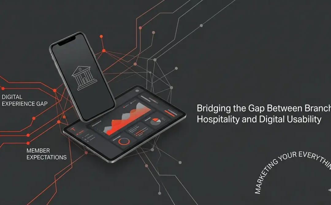
by threshold | Jun 23, 2026 | AI, AI Marketing, Digital Marketing, Financial Marketing, General
For decades, community banks and credit unions built their reputations on the branch experience. A warm greeting, a handshake, and deep roots in the community were the ultimate differentiators. If a member walked through the physical doors, they were guaranteed a high-touch, frictionless experience.
But when that same member opens your mobile app or visits your website? The experience often feels completely disconnected.
In modern financial services, member growth is rarely a product problem. Your auto loan rates are competitive. Your checking accounts offer great rewards. Your mortgage terms are solid. Growth is a visibility and experience problem. If your digital channels are clunky, hidden behind poor search visibility, or fragmented by disconnected user journeys, your excellent products simply don’t matter.
To win modern consumers, financial institutions must close the painful gap between the warm hospitality of the physical branch and the cold reality of their current digital presence.
quick summary: the digital banking expectations gap.
- the Vvsibility bottleneck: Growth fails because high-quality loan and deposit products are buried behind poor SEO, slow page speeds, and bad navigation.
- the experience standard: Consumers do not compare your mobile deposit or loan application to the credit union down the street—they compare it to Uber, Amazon, and Netflix.
- the solution: Financial institutions must evolve from passive informational websites into highly personalized, interconnected digital acquisition engines.
1. shifting from product pages to frictionless conversion funnels.
Traditional banking websites operate like digital brochures. They feature endless rows of tabs listing interest rates, disclosure agreements, and compliance text. While this information is necessary, it treats a visitor like a browser rather than an active applicant.
When a consumer walks into a branch to open an account, an expert employee guides them through the paperwork step-by-step. Digitally, that same journey is often replaced by an endless, unoptimized PDF form or a jarring redirect to a third-party core processor system. Closing the gap means auditing every digital touchpoint to eliminate clicks, pre-fill data fields where possible, and ensure a user can apply for a loan natively from any device in under three minutes.
Modern data engines allow national megabanks to anticipate consumer needs with eerie accuracy. If a consumer browses a house on Zillow, their banking app serves a personalized mortgage calculator an hour later.
Community institutions have a wealth of first-party member data sitting idle in core processing silos. True digital personalization means utilizing that data to alter the web experience dynamically. If an existing member with a high checking balance visits your homepage, they shouldn’t see a generic hero banner for a basic checking product—they should immediately be served a targeted high-yield CD offer or an auto-refinance prompt tailored to their financial footprint.
3. prioritizing search and answer engine visibility (AEO).
Because financial research is increasingly moving away from traditional Google results and moving toward AI platforms and conversational answer engines, visibility is your primary acquisition battleground.
If a consumer asks an AI assistant, “What is the best high-yield savings account near me with low fees?” your institution must be semantically structured to be pulled as the definitive answer. This requires structuring your website data cleanly, answering complex consumer questions directly on your pages, and making sure your core value propositions live in high-density text fields easily scraped by search crawlers. Thankfully, that’s something we can do for you.
4. the omnichannel handoff: ending the fragmented journey.
One of the largest friction points in regional banking is the broken handoff between digital and physical channels. If a member begins a mortgage application online, hits a snag, and decides to call or walk into a branch, they expect the staff to know exactly where they left off.
Too often, internal team silos mean the branch staff has zero visibility into online abandonment. True digital excellence means connecting your marketing automation, digital application portals, and branch CRM systems. When your digital engine communicates flawlessly with your physical staff, you provide the seamless, omnichannel experience consumers now demand.
the strategic imperative for leadership.
Closing the digital experience gap requires a cultural shift. Digital can no longer be treated as an operational IT expense; it must be funded and managed as your primary, highest-producing branch. By prioritizing frictionless conversion, deeply integrating your member data, and structuring your content for modern search visibility, you can translate your legendary in-branch service into an unstoppable digital growth engine.
frequently asked questions about digital banking expectations.
what is the biggest mistake regional banks make on their websites?
The biggest mistake is treating the website as a static brochure rather than a dynamic sales funnel. Banking websites must prioritize clean user experience, fast page load speeds, and direct paths to native account opening platforms.
how do credit unions compete with megabanks digitally?
While regional credit unions may lack the massive development budgets of national banks, they can win by focusing on hyper-local SEO, optimizing for conversational AI search queries (AEO), and using targeted, first-party member data to personalize the digital funnel.
why do online loan applications suffer from high abandonment rates?
High abandonment is usually driven by technical friction, such as excessive form fields, a lack of mobile optimization, or jarring redirections to unsecured-looking third-party portals during the application process.