by threshold | Jul 6, 2021 | Creative, Design, Digital Marketing, General, Marketing, Tech/Web
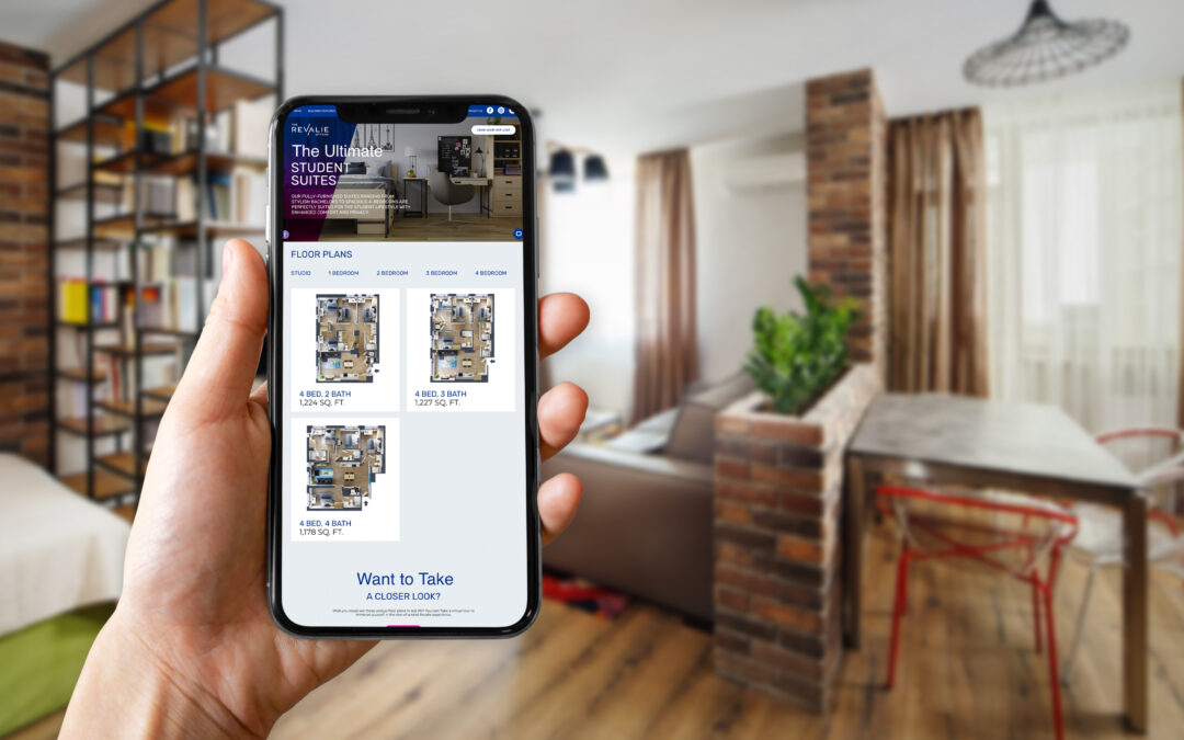
Floor plans: every apartment marketing team needs them, but how important are they really? You might be surprised at how big a role floor plan graphics have to play in your digital real estate marketing strategy. Not only can a lack of floor plan graphics result in poor UX on your website, but it can also rob you of key branding and marketing opportunities that help drive qualified leads and conversions.
Here are some of the key ways floor plan images can make or break your digital real estate marketing results.
Prospects Refine Their Apartment Search Based on Floor Plans
Keyword research shows that, no matter what your market or your target audience is, people are searching specifically for floor plans based on the number of bedrooms. It’s part of what makes ILS platforms like Zillow and ApartmentFinder so popular; users can refine their search by the number of bedrooms and bathrooms. But when they take their search to Google, they refine their search manually by typing in search terms like “3-bedroom apartments in Austin” or “studio apartments Austin.”

These search habits have a lot to teach us about user intent: from the very beginning of their apartment search, the number of bedrooms is central to their housing decision. When a prospect encounters difficulty in gathering detailed floor plan information about your property, they’re that much more likely to bounce from your website or disqualify your property as they move into the consideration phase of the digital renter’s journey.
And the more information prospects can learn from these floor plans, the more likely they are to recognize your property as a viable option and take the next step by scheduling a tour or starting an application. In other words, 3-D floor plans, floor plans with dimensions, and higher-resolution floor plan graphics help result in more qualified leads coming in through your web presence.
Floor Plan Images Can Be Used Throughout Your Digital Real Estate Marketing
Floor plans aren’t just for your brochure or your website (although you should definitely use them there!). Floor plan images also provide fodder for additional digital marketing platforms like Google My Business posts, social media posts, and ad images or video. And the higher quality these floor plans are, the more versatile they will be.
Say, for example, that one of your floor plans has a high vacancy rate while others are sold out. Having high quality floor plan images means you can easily promote that specific floor plan through your posts and stories on Instagram and Facebook. You could also run an ad campaign featuring the floor plan graphic alongside interior photos or renderings. Carousel ads and video ads work particularly well for this purpose.
Floor Plans and Site Plans Add Branding Opportunities
Floor plans aren’t just a convenient way to convey information. They’re also an opportunity to show users that you’re committed to providing a positive user experience, which also signals that they can expect a positive renter experience at your community. Plus, floor plans and site plans can be used in creative ways to highlight your brand personality. Doing so ensures that your units don’t blend in among all your competitors offering similar unit types.

Everything from brand colors and patterns to unique messaging can be added to your floor plan design. You could show off your branding through the floor plan design itself or by adding a branded border or background. You could even implement a unique hover state on each floor plan image on your website, if you have the ability to do so. Whatever tactic you choose, the more you can signal that your apartments are unique to your community, the more likely it is that your prospects will pay attention and eventually reach out to schedule a tour or start an application.
High-Quality Floor Plans Signal Modernity and Reliability
Not all floor plan graphics are created equal. A low-quality, low-detail floor plan image can be almost as bad as no floor plan at all. Your floor plan images should be accurate to scale, have good color contrast (which is particularly essential for prospects with color blindness or other vision impairments), and match the look-and-feel of your brand. If they feature easy-to-read dimensions, room labels, and amenity labels for sought-out features like in-unit washer and dryer and walk-in closets, that’s even better. Best of all, 3-D floor plans help bring your apartments to life complete with interior design elements and a clearer sense of scale for the viewer.

For the sake of argument, let’s compare the two floor plan images above. While the 3-D floor plan on the right does not include labels or dimensions, it still does a much better job of portraying the scale, features, and personality of the one-bedroom apartment it represents. A user viewing this floor plan can imagine themselves living there and feels confident that the unit comes with the amenities that are important to them, since they are clearly visible in the image. Meanwhile, floor plans like the one of the left don’t inspire much confidence in the user viewing them. Why? Not only does it lack detailed labels or dimensions, it also makes it challenging for the viewer to understand how large each room will feel, how modern the unit is, and what amenities it has. The apartment on the left could be fantastic, but it comes across as lackluster and illegible, making it less likely that a user will continue exploring this community for long enough to fall in love.
Those are just some of the key ways that floor plan graphics can make or break your digital real estate marketing results. For more information on how you can improve your digital marketing results, check out our post on How To Improve UX on Your Property Website (and increase conversions) or take a scroll through the Digital Buyer’s Journey For Real Estate.

by threshold | Jun 1, 2021 | Creative, Design, Marketing, Tech/Web, Thought Leadership
 Written by Chelsea Friel, Graphic Designer
Designing with accessibility at the forefront has never been more important, but it can be daunting to determine whether or not your website is in compliance with regulations. In 2020 alone, over 3500 digital accessibility lawsuits were filed, including federal and state ADA lawsuits, and an estimated 56 million people in the U.S. are currently living with a disability. As we look to expand our services in the real estate and housing market, it’s paramount that we keep accessibility top of mind in our work. The goal is to improve our practices to make our designs as accessible as possible for the widest audience, and to make usability as high a priority as visual appeal.
What Does Web Accessibility Look Like?
To be frank, the word “compliance” doesn’t exactly bring to mind a font of creative flights of fancy. It usually summons images of black Arial text neatly organized on a white background, which is fine for doing your taxes but less than ideal for promoting your sparkling new multifamily property. In truth, adhering to Web Content Accessibility Guidelines (WCAG, from here on out) is pretty easy to incorporate alongside our existing design practices. WCAG ratings are ranked from A to AAA, in a sort of “good, better, best” system. If A is the rank for a solidly usable website, then AAA is the gold standard of accessibility.
Similarly to how we build successful brands that thrive in the wild, the process of establishing an accessible web presence requires some collaboration between designers, copywriters, and developers. By keeping a few helpful guidelines in mind, each team’s work contributes to a fully accessible real estate website that anyone can (and will want to) use, regardless of their level of ability.
A Helpful Guide for Accessible Design
Contrast
When establishing a color palette, high contrast is critical for usability. When considering moderate to severe visual impairment, the ideal contrast ratio is between 1 to 3 and 1 to 4.5, depending on the size and the boldness of the text. The larger and thicker the characters, the lower the ratio can be while maintaining legibility to the eye, or to a screen reader. Any important copy should be designed with the highest contrast possible to ensure greater visibility for users.

Chrome extensions such as Spectrum can help you determine how user-friendly your website is by showing you alternate versions of your website based on various visual abilities.
Alternate Indicators
On the topic of visual acuity, consider using alternate methods of establishing a hierarchy of content apart from color changes. If a piece of text changes color when a user hovers, the addition of a line under the text serves as an additional cue that the copy can be clicked or is interactive in some way. Other visual indicators can be icons, boxes, or typeface changes (such as semibold to bold or black) to indicate to the user that they’re on the right track.

Charts and graphs can also present a challenge. Apart from using distinct colors to designate a data set, one solution is to incorporate texture or patterns into the design to further differentiate the information presented to the user. Trello has a plugin that can convert graphs using color blindness–friendly patterns to help aid legibility for all users, while maintaining the overall look and feel of the design.
Alt Text & ARIA Labels
Used to describe an image when it is unavailable to the user, alt text and ARIA labels should provide as much detail as possible. Describe what’s happening in the image instead of opting for the file name or a bland categorization of the subject like “man” or “house.” For folks who use screen readers to navigate websites, this attention to image descriptions provides a much clearer idea of what is in the design and what the website is trying to convey. This can be a key factor in whether or not they pursue your property further, depending on how well you describe the photo of the premises or the neighborhood using these tags and labels.

Content and Type Hierarchy
When writing copy for a website, simpler is better. Important messages should be short and to the point, while conveying all of the essential information a user needs to know right off the bat. WCAG recommends limiting a line of text to 80 characters or fewer, and to avoid writing overly complicated or lengthy sentences. Designers and copywriters should work in tandem to draft copy that looks beautiful in the design, excites the user with its content, and can be read by as many people as possible, regardless of the tools they use to view the website.
UI and Navigation
Users of varying abilities frequently use keyboard navigation to explore websites, and care should be taken to establish a logical flow of information. Good design is obvious, and a user shouldn’t have to spend time deciphering how to move through a website to find what they need. Clean focus states, clear and easy-to-remedy error states, and concise links makes a site more accessible to all, and provides a better user experience across the board.
Designing for Everyone
Accessibility should always be as high a priority as creating a beautiful design. A visually stunning website that can only be accessed by half of our users is ultimately a design failure, and our goal should be to be as inclusive as possible in our work. As we continue to go above and beyond for our clients and our audience, normalizing accessibility practices deepens our understanding of who we serve, and provides a more inclusive space where all are welcome.
by threshold | Apr 28, 2021 | Creative, Design, Digital Marketing, Marketing, Tech/Web, Thought Leadership
 Written by Weylan Lee, Senior Graphic Designer at Threshold
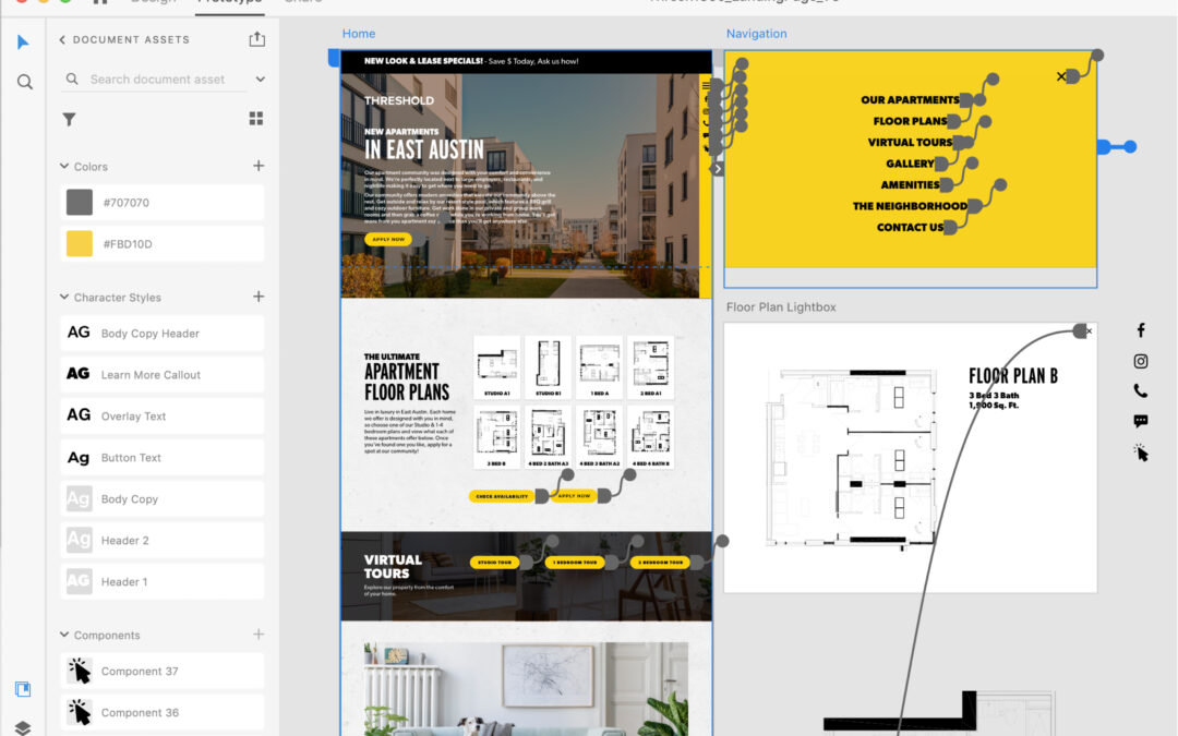
User experience and user interface (UX/UI) design are both in high demand, especially for digital spaces like apartment websites and mobile apps. With this high demand comes many tools that cater towards UX/UI design. At Threshold, we use Adobe XD, which is a design tool that allows us to create and prototype interactive experiences like websites, digital products, and mobile apps. With this tool, our teams are able to design, animate, prototype, and collaborate more efficiently, experiencing our designs just like an end user (i.e. our clients’ residents and prospects) would. This has significant advantages both for us internally as well as for our clients and their end users.
How Adobe XD Improves the Real Estate Marketing Client Experience
First and foremost, Adobe XD allows us to present our compelling and amazing website designs more comprehensively and engagingly for our clients. With XD, instead of designing static pages and leaving it to the imagination how they will animate or link to one another, we are able to incorporate engaging user experiences and interactive functionality that enhance our client’s brand and optimize for conversions from the very beginning. Our clients are able to view and experience their website designs just like a viewer would on a live website. They can scroll down a web page, click on links and buttons, interact with CTAs, as well as interact with things like galleries, floor plans, location maps, and much more. Plus, with the ability to leave comments and replies right on website designs, using Adobe XD allows our clients to make more informed decisions and provide accurate feedback, streamlining our collaboration with our clients.

How Adobe XD Improves Collaboration for Creative Real Estate Marketers
For our internal teams, using Adobe XD has allowed us to design more immersive and impactful website experiences and made our internal collaboration more efficient – which also benefits our clients! Our designers are able to experience and interact with their website designs in real-time as they are designing. This allows us to create more impactful, engaging user experiences and ensure that a website not only looks amazing and functions properly, but also provides a great experience. Adobe XD also allows for the creation of brand-specific design libraries, which our designers use to ensure that a client’s branding (fonts, colors, buttons, and more) is applied consistently throughout each page of an entire website. Even better, the collaboration tools within Adobe XD allows our designers and developers to share website assets and details more efficiently, reducing project timelines and ensuring a smoother transition between design and development.
Why You Should Work With a Real Estate Marketing Agency That Uses Adobe XD
To sum it up, by using Adobe XD, our teams are able to create impactful user experiences that our clients (and their current and future residents) will enjoy. The improved and efficient collaboration between our internal teams and our clients and project teams means that we are able to reduce project timelines and ensure we are creating the highest quality websites for our clients. Our project teams are able to spend more time on creating amazing and impactful website designs with great experiences. At the end of the day, that all leads to increased conversions and customer loyalty among our clients’ prospects and current residents.
by threshold | Jan 6, 2021 | Creative, Design, Digital Marketing, Marketing, Tech/Web
For real estate developers, leasing and property management teams, apartment marketing agencies, and in-house real estate marketers alike, fair housing requirements have been an evolving consideration when it comes to how we do our jobs. With guidelines still emerging and clarifying, especially for the digital space, this topic can sometimes feel like a moving target. Regardless, it’s essential to put in the time and attention required to understand how legislation like the Fair Housing Act (FHA) works to reduce housing inequality across factors like race, disability, and national origin.
Our goal with this article is not to replace your legal counsel, but to provide our learnings and recommendations for FHA-compliant apartment marketing that supports a more equitable housing market. Our goal is to empower you with a better understanding of how you can not only act within the guidelines of FHA law, but more importantly, how you can avoid inequitable impact toward disadvantaged groups when you market your housing to your audience. After all, inequitable impact can occur more easily than you might think, and much of it is done unintentionally. But take heart, real estate marketers; a little extra effort and consideration can go a very long way.
So let’s start by introducing the Fair Housing Act, then we’ll discuss our recommendations and action items for marketers like you.
What is the Fair Housing Act?
The Fair Housing Act prohibits the making, printing, and publishing of advertisements that indicate a preference, limitation, or discrimination because of race, color, religion, sex, disability, familial status, or national origin.
It’s designed to not only outlaw explicit housing discrimination against these protected classes of people, but also to reduce housing inequality that may be caused in unintentional or subtle ways.
Housing Inequality refers to a disparity in housing availability and quality across variables like race, class, disability, and more. Housing inequality is typically a result of systemic factors both past and present, from Red-lining to wage inequality.
Housing inequality may include…
- less housing available to certain groups
- less affordable housing available than demand requires
- less access to local resources (e.g. schools, parks, transportation, social services) for certain groups due to where they predominantly live
- and more.
History of the Fair Housing Act
The FHA is considered amongst the last major acts of the ‘60s Civil Rights Movement. It was called for by civil rights activists of the 60’s including Martin Luther King, Jr., who demanded an end to redlining and other discriminatory housing practices that were preventing many Black and Latinx people from renting in certain neighborhoods. The act had been introduced to Congress when MLK was assassinated on April 4th, 1968, increasing pressure on Congress to pass the bill. It was then passed prior to MLK’s funeral.
But the FHA didn’t end housing inequality. While it has positively impacted many Black and brown renters and homeowners, a variety of systemic factors still result in housing inequality today. For example, the FHA did little to disrupt a trend of “white flight” between 1950 to 1980, when the Black population in America’s urban centers increased from 6.1M to 15.3M. During this time, whites moved out to the suburbs, taking many of the employment opportunities Black people needed into communities where they were not welcome.
Since its initial passing, a number of amendments and provisions have expanded the language of the FHA. Notably, in 1988, Congress passed the Fair Housing Amendments Act, expanding the classes protected by the act to include disability and familial status (e.g. people currently pregnant or with children).
During the Obama administration, the AFFH (Affordably Furthering Fair Housing) provision of the FHA was introduced, which expanded both accountability and resources given to cities and regional governments receiving HUD (Dept. of Housing & Urban Development) funding. These rules and resources were designed to Affirmatively Further Fair Housing by incentivizing fair housing efforts at the governmental level. However, in 2020, the Trump administration amended this provision, rolling back most of the accountability and resources provided by the provision. This change makes it less likely for fair and affordable housing to be built, but it doesn’t ultimately impact a marketer’s responsibilities to either the FHA law or to ethical ideals.
Protected Classes Under the Fair Housing Act
Race, color, religion, sex, disability, familial status, and national origin are all protected classes under the FHA.
Many state and local laws have more expansive fair housing protections that prohibit housing discrimination based on additional protected classes, such as sexual orientation, marital status, source of income, and use of Housing Choice Vouchers.
In some cases, political affiliation may also be a protected class according to a webinar by the National Fair Housing Alliance.
Below are a few examples of who and what these protected classes cover and don’t cover.

What Counts As “Advertising” Under the Fair Housing Act
It’s important to realize that under the FHA, the definition of advertising is actually very broad. It includes…
- print and online advertisements
- print materials such as brochures or applications
- television and radio ads
- and even speech.
In other words, the FHA can cover messaging from a brand or people associated with the brand even across media that may not strictly be advertisements as typically defined. For example, expressing an illegal preference or limitation to one of your fellow agents, brokers, employees, prospective sellers, renters, or to any other person in connection with the sale or rental of your property is illegal under the FHA. Here are two examples of illegal advertising that you may not have realized were violations of the Fair Housing Act (examples provided by the Fair Housing Institute).
- A maintenance man tells a passer-by that “only real Americans” live in the apartment complex where he works.
- A rental office is decorated with many large pictures of the residents participating in the community’s facilities and amenities such as exercising in the weight room, swimming, and playing volleyball and tennis. However, all of the pictures are of white, young, “yuppies;” none of the pictures shows children, or persons of differing races or nationalities.
Best Practices for Fair Housing Compliant Marketing
FHA-Compliant Copywriting
When it comes to writing fair housing compliant copy for your apartment marketing materials, it’s important first and foremost to use inclusive language as often as possible. This includes the following:
- Use gender-neutral terms and pronouns as often as possible. (e.g. “partner” or “spouse” instead of “husband” or “wife;” “child” or “student” instead of “son or daughter;” “they/them” instead of “he or she/him or her;” etc.)
- Avoid mentioning specific religious holidays or practices
- Avoid mentioning specific national or regional origins
It’s also wise to eliminate the use of buzzwords like “Restricted,” “Exclusive,” or “Limited,” as these have been associated with discriminatory practices in the past. If tempted to use these sorts of buzzwords, consider similar words instead like “Luxurious,” “Deluxe,” “Quality,” or “Sophisticated.”
It’s also important to avoid the temptation to speak about who you see as the ideal resident of your community. For example, if you have a community with a playground, you might be tempted to say that your apartments are “perfect for families,” but this expresses an illegal discrimination or preference for one of the protected classes under the FHA. Instead of indicating who you think should live at your community, focus on the amenities, features, and local attractions your property offers. Always offer truthful information about the availability, price, amenities, and features of a housing unit and leave it up to your prospects to determine whether the community is right for them.
In addition, when writing copy for websites, social media posts, articles, and the like, consider how legible the copy will be to a person reading your content via a screen reader program rather than by sight alone. Use capitalization and punctuation in ways that make it easier for these screen reader programs to parse copy (e.g. capitalize each word in a hashtag as in #ScreenReader).
FHA-Compliant Design
When it comes to design, representing diversity should be a top priority whether you’re launching new ads or designing a website. Use photos of diverse groups of people from all protected classes whenever possible. If you have to depict just one or two people in a given image, consider depicting a person or people from another protected class in the next image. In general, your goal is to provide an overall impression of diversity for a user that encounters your brand assets. Don’t forget that diversity doesn’t just include racial diversity, it also includes things like gender, disability, and religious diversity.
It’s also wise to incorporate the Equal Housing Opportunity logo in your ads and on your website. While the Fair Housing Act itself does not require the use of Equal Opportunity logo in any ad, using the logo does show your company’s commitment to fair housing compliance.

Similarly, we recommend incorporating the Americans with Disabilities Act Icon wherever relevant, such as on a floor plans or community amenities page. Several federal laws require that private and federally-assisted housing be accessible to persons with disabilities. While this icon is not required on marketing materials, it acts as further evidence of your company’s commitment to fair housing compliance and encourages people with disabilities to apply to live at your community if they see the icon on your website or other assets.

For more resources on creating accessible design across digital and print marketing, we recommend looking into dedicated resources like W3’s Web Accessibility Initiative, UX Design’s post on Accessible Design, and Smashing Magazine’s article on Designing for Accessibility and Inclusion.
ADA-Compliant Websites and Accessibility
While the Americans With Disabilities Act prohibits discrimination on the basis of disability, it doesn’t provide much in the way of accessibility guidelines to determine how accessible a website is to people with various disabilities. To put it generally, everyone, including persons with disabilities, should be able to enjoy the “full and equal” use of your website; they should be able to access content, navigate your website smoothly, engage with different elements, etc.
When it comes to more concrete guidelines, U.S. courts and the Department of Justice have continually referenced the Web Content Accessibility Guidelines (WCAG) 2.0 Level AA success criteria as the standard to gauge whether websites are accessible. The WCAG 2.0 AA success criteria are comprised of 38 requirements and you can learn more at W3’s Web Content Accessibility Guidelines (WCAG) Overview. Although there is a lot here to sift through, WCAG 3.0 is scheduled for release in 2021 and is intended to be a much more inclusive set of guidelines that are easier to understand and implement.
Using an accessibility widget is a great way to cover many of the WCAG guidelines for your website. An accessibility widget is a plugin that helps users with disabilities access the site and may allow users to adjust factors like contrast and font size, use keyboard navigation or page readers, and stop animations on the site. No plugin guarantees 100% coverage of the WCAG guidelines, but nevertheless, they are a great addition to your website.

FHA’s Impact on Digital Advertising for Apartments
Thanks to guidance from the Fair Housing Act and similar legislation, the housing industry has emerged as one of the first to receive official legal guidelines for digital advertising tactics. While traditional marketing has operated under clearer legislation, the digital space has long been a legal frontier as legislators, courts, and thought leaders work to catch up.
In 2019, platforms like Facebook and Google, who represent the lion’s share of digital advertising space, began making changes to their advertising options. To summarize, the platforms have now eliminated or adjusted a number of targeting options for ads falling into the categories of housing and finance in order to bring their platforms into better accordance with FHA and similar legislation. These changes—such as the removal of zip code targeting, age targeting, and targeting based on certain interests—reduce the possibility of inequitable impact across the protected classes under the FHA. You can learn more about Facebook’s targeting changes and Google’s targeting changes in our other posts, linked here.
What We Expect To See Next For Digital Marketing
These targeting changes on Facebook and Google are likely to act as forward momentum for similar such changes in the future. We expect cookie privacy and other privacy concerns to be a large part of the discussion in the coming years. We also expect other platforms beyond Facebook and Google to begin seeing regulation (if they don’t initiate changes proactively themselves).
by threshold | Nov 10, 2020 | Creative, Design, Digital Marketing, General, Marketing, Thought Leadership
From apartment Facebook ads to banner ads through Google, display ads often play a central role in a real estate brand’s digital marketing mix. Since we’re a full-service apartment marketing agency here at Threshold, that means we’ve spent a lot of time perfecting our understanding of the design, messaging, and other elements that contribute to effect display ads for apartment marketing campaigns. Today, we’re passing on our must-know tips for real estate display ads.
This article will cover tips for design and messaging dos and don’ts for real estate display ads; it will NOT cover tips for how to target your ads through the various advertising platforms that support display ads (Google Ads, Facebook, Instagram, and so on). If you’re interested in a post of ad targeting tips, let us know by dropping us a line on our contact page or sending us a message on Instagram!
Keep Copy Short and Descriptive for Apartment Display Ads
When your apartment community has so much to offer, it can be challenging to keep your ad messaging short! But there are a number of reasons why it’s essential to stay brief. The primary reason is that short copy is just more effective. Users typically encounter display ads as they go about their normal online lives, and as a result, they have precious little attention to devote to your ad. Ensuring that your ad message can be parsed quickly and effortlessly is essential if you want to work within this limited attention span to reach your qualified audience and earn their clicks.
Speaking of limited attention, copy-heavy ads can crowd out more engaging elements of ad design. Data show that ads with high-quality images and video earn far more clicks and engagements than ads without these features. When you crowd your visuals with copy, you compromise the ability of the visuals to drive this performance boost.
Not only that, but the more copy you include, the less legible your message is likely to be, especially when dealing with smaller ad sizes. Keeping your message short ensures that the copy will be legible across a wide variety of devices and ad placements.
Some platforms even restrict the amount of copy you’re allowed to have on a display ad. When it comes to apartment Facebook ads, for example, apartment marketers have long been working with a restriction called the “20% rule,” which restricted the use of ad images with text on more than 20% of the image. In 2020, Facebook announced that they would be removing this rule, but still recommend that you follow the 20% guideline, as ads with less copy tend to see better results on their platform.

A Facebook display ad following the 20% rule
So, given the limited room for ad messaging, what makes for effective real estate ad copy? Most importantly, you need to provide just enough information that it’s clear what the ad is for. Remember, the user is only devoting a few seconds at most to reading your ad, so it needs to be immediately obvious what’s being advertised or you’ll lose out on the people in the audience who might actually be interested to learn more. A headline of about 3 to 5 words (or around 30 characters) is usually best. For example, “Apartments Near UMD” or “Special Rates on Austin Apartments” get to the point quickly and clearly communicate the important information that a user needs to know in order to determine if this offer is relevant to them. You have more flexibility with copy length on certain ad sizes (for example, banner ads can incorporate slightly more copy), but in general, the shorter the better, especially if you want users to click through.
As long as you’ve mastered the short and sweet headline, you may be able to drive more qualified clicks by getting as specific as you can in the space available. For example, if the ad size is large enough to accommodate it, a subheader listing the available floor plan types or a “starting at” price may be beneficial. Where a subheader isn’t possible, just be as specific as you can within the 30 characters or so you have in your headline.
Finally, for ads that feature a CTA Button, keep that short and sweet too. “Apply Now,” “Lease Today,” or “Learn More” works great for apartment display ads.
Use High-Quality, Visually-Engaging Property Photos
We already mentioned that high-quality visuals contribute to better ad results for real estate display ads. But what counts as high-quality? What photo composition elements make an ad visually engaging?
We have an entire article devoted to answering exactly that question, which you can find here. In short, the angle, lighting, and staging of the photo all make a difference, as does the color composition (more on color below). The image should also have a single, clear focal point. If the user isn’t sure where to look, they’re not going to waste time figuring it out, they’ll just scroll right past your ad.
If good photos or renderings aren’t available, lifestyle imagery may work better than using a poor-quality photo. Stock images featuring one or two smiling people who fall into your renter demographic are common options.

A retargeting ad using a lifestyle photo
Use Bold Colors and High Contrast When Designing Your Real Estate Display Ads
Use bright colors to draw consumer attention to your ad. This is especially important with call-outs and buttons, which should be contrasting colors for high visibility. This doesn’t mean your ad should be garish; a little knowledge of complementing colors can go a long way when you want to use bold colors while still being easy on the eyes. For example, if you use a photo for your banner ad with a blue sky background consider an orange button and orange action text.
Bear in mind, though, that your branding should be consistent between your display ads and the landing page the ad links to, so use brand colors as a starting point. Ensuring that your apartment’s display ads make use of your brand’s colors and fonts make the ad’s look and feel consistent with the website. This also avoids confusing users by making them think they clicked on the wrong link.

A banner ad using contrasting colors
Tailor Ad Sizes To the Type of Apartment Display Ad Campaign You’re Running
Some ad sizes statistically perform better than others, but your choice of which ad size(s) to use for your apartment display ad campaign may be more complicated than it appears at first glance. That’s because different ad sizes are better for different goals.
For example, if your goal is to maximize impressions, ads that are 300×250 or 728×90 pixels may be your best bet. However, if your goal is to earn clicks, the highest-performing ad sizes tend to be 336×280 and 300×600 pixels. Let’s break that down a little further. That means that if you’re running an awareness campaign, where impressions are a more important factor, the 300×250 and 728×90 ad sizes may suit you perfectly. However, if you’re hoping to drive immediate leasing results, you need people to actually click through. In this case, 336×280 or 300×600 may be your better choice.

A 728×90 Retargeting Banner Ad
Your best sizing choice may further vary depending on what type of campaign you’re running. For example, smaller ad sizes for retargeting campaigns may work better because the user is already somewhat familiar with your brand and the ad can help you stay top-of-mind no matter how small it is. But for new traffic or lead gen campaigns, larger ad sizes give you a better opportunity to showcase why a user should bother to learn more. The ad size you choose may also depend on the message you need to deliver. If you need more room to accommodate a longer message (say, a special rate on specific floor plans), then a 728×90 banner ad like the one pictured above may work well.
Those are all our top tips for creating effective display ads for apartment marketing campaigns! If you have more questions, don’t hesitate to reach out to our team! We’re always happy to talk digital marketing strategy.

by threshold | Sep 22, 2020 | Creative, Design, Digital Marketing, Marketing, Tech/Web, Thought Leadership
Every good digital marketing plan for real estate must take into account the user experience on property websites. After all, a digital ad is only as good as the landing page it directs to, and a bad first impression can destroy your chances with a prospect. Real estate marketers today know they need to provide a great user experience on property websites, but they aren’t always sure how to improve UX or use strong UX design from the beginning.
If this sounds like you, don’t worry, we’re going to go through some UX tips for apartment websites. These tips range from quick fixes to broader strategies, but every one of them will help you build websites that meet user’s needs and encourage them to take the actions that are important for your bottom line.
Study User Behavior
First and foremost, you need to understand your users. Not just users in general, but your users; your audience’s browsing habits, goals, needs, motivators, and preferences. Each market is different and so is each person, but a few strategies can help you discover broad habits that your site should cater towards, like what information is important to your users and what device they usually use to search for housing or access your resident portal.
Conduct a Focus Group
A focus group survey can help you understand a lot about your audience. While the best focus groups require diligent survey design, the payoff can be massive.
When conducting focus groups, make sure to get as representative a sample as possible for your city, university, or age group. You might want to offer an incentive to attract more participants—for example, with a chance to win a gift card once the survey has been completed.
Avoid asking leading questions or limiting the answers your respondents can give. Keeping things open-ended is the best way to ensure you learn something you didn’t already know (or assume).
Use Scrollmaps
Scrollmaps are a tool you can use to study user behavior on a site that already exists. It shows you where users tend to linger on a page, where they tend to click, and which areas fail to hold their attention. This is a particularly useful tool if you want to identify areas for improvement on a website you’ve already built.
Scrollmaps can’t provide a full picture, however, because they don’t show you what your users would be doing if things were different. They can only show you what they are or aren’t doing right now. In other words, they’re better at identifying problems than solutions. Still, they can be a great place to start.
Study Your Google Analytics
For more insights into user behavior on already existing sites, Google Analytics is a fantastic resource. It allows you to see which pages have the highest bounce rate or lowest time spent on-page, which pages are most viewed and which are rarely seen. These insights can help you identify sections of your site that need improvement. Combined with the use of scrollmaps, this strategy can give you a lot of information about your current UX without having to ask users directly.
Consider Your Mobile User Experience

While many users’ housing searches take place primarily online, mobile phones and tablets still represent a significant portion of the traffic to your property website. In fact, a user is especially likely to encounter your property website on their phone during the discovery phase, when they’re forming their initial opinions and deciding which properties will move forward into their consideration phase. This means having a responsive website—one that’s optimized for a variety of screen sizes—is essential in making a good first impression.
If you’re not sure how to turn a website design that’s optimized for desktop into one that works on mobile, here are a few basic guidelines.
When it comes to website design for mobile:
- Stack content vertically instead of horizontally
- Use image carousels instead of images arranged in a grid pattern
- Implement expandable elements so users can expand and collapse information as they desire
- Use an expandable “hamburger” navigation menu that remains out-of-the-way when not in use
Address Long Loading Times
Nothing contributes to high bounce rates more than a slow load time. That’s because a slowly-loading page makes for a terrible user experience in a world grown accustomed to lightning-fast internet. Users just don’t have the time or patience to wait for your site to load, especially when they have other options available to them.
The best way to reduce page load times is to be aware of the common culprits—namely, video and images. When you have several large image or video files on a page, it takes much longer to load, even on the best internet available today. It’s best to keep each image or video under 500KB wherever possible.
That’s not your only option, though. Sometimes, you might need to include a large file (or several). In cases like these, you can instead defer certain elements from loading on the page until they’re needed, or until the rest of the page loads. For example, you can wait to load a video until a user scrolls to the section of the page it’s on.
Make Pages More Engaging

The longer a user spends on a page, the likelier they are to take a conversion action or become loyal to your brand. But you need to give them reasons to stick around, and that means offering a great experience while they’re there.
One of the best ways to improve website UX by making your pages more engaging is to incorporate great images and video onto as many pages as possible. Users like to have something visual to enhance their understanding of information and hold their focus.
For apartment websites, we highly recommend taking high-quality photos and video of your community and incorporating them throughout your webpages (not just on a gallery page). Virtual tours have become a must, and your homepage can be a great place to feature a professionally edited community tour video or even feature Matterports of your top floor plans.
Make Pages More Scannable
Much as website creators might want them to, users don’t read pages from start to finish. Instead, they scan pages for the information they need or content that engages their attention.
Work with user habits and not against them by making your pages easier to scan. This creates a better user experience on your property website and improves your chances of showing a user that your community is right for them.
Tips for making web pages more scannable include:
- Develop a clear hierarchy of information by using header tags, consistent font and formatting styles, and visual cues that help signal separate chunks of information (like font color, font weight, background color, and other design elements).
- Use headers that clearly signal the content they introduce (e.g. “Community Amenities” or “Amenities for an Active Lifestyle”).
- Avoid long blocks of text. Break up text into sections of about 100 words or less.
- Avoid repetition. Repetitiveness confuses the reader about where they can find the information they’re looking for. It can also seem spammy to users and search engines alike.
- Use bullets or lists when you can (like we just did).
Make In-Demand Pages Accessible
Some pages are more important than others, and you want to make sure your users can easily find and use the pages they need the most (and the pages you most want them to use). For apartment websites, that’s typically your application portal, contact page, and resident portal. It might also be a page housing your virtual tour or floor plan availability. There are a few things you can do to make these in-demand pages more accessible.
Firstly, let’s talk about accessibility in terms of how easy it is to find. Use clear Call-To-Action buttons at the tops of pages—especially your homepage—to direct users to what they need and where you want them to go. You might also use borders and contrasting colors in your navigation menu or headers to make links to these pages clearer and more attractive.

Making pages more accessible also means making them easier to use for as many users as possible, including those with disabilities. For example, make sure you use fonts that are large enough for all users to read. You should also avoid using colors that provide poor contrast with one another, especially for text and CTA buttons.
Don’t Forget About Micro-Copy
“Micro-copy” refers to those small pieces of text that guide a user through your website, like the text on a CTA button or the error message they get when they fill out a form incorrectly. It’s easy to overlook the power of strategic micro-copy, but these are often high-impact areas that define the quality of a user’s experience in spite of their relatively small real estate.
Beyond their usefulness in guiding a user clearly through your website experience, micro-copy also offers a great opportunity to turn something generic into something that expresses your unique brand and really makes an impression on users. For example, the ubiquitous “Submit” button is boring and not all that descriptive. A button reading “Send My Message” or “Make Me a VIP” is more descriptive, personal, and flavorful.
Micro-copy applies to areas like CTAs and form fills but can also include hover copy to let a user know something is clickable and what will happen when they click (e.g. on an image or button), like in the below example.

Micro-copy also allows you to set expectations for what will happen when a user does something, which makes them far more likely to take the conversion actions you want them to take. For example, if you want the user to contact you to schedule a tour or start an application, including the text “We’ll read your message thoroughly and get back to you within 24 hours,” near the contact form gives a user the confidence that taking that action will lead to their desired result.
That’s all our tips for improving UX on apartment websites! If you want to learn more about UX or get professional assistance with your UX Design, you can do so by filling out our Contact Form. We’d love to hear from you.