your floor plan page is the whole funnel.

your floor plan page is the whole funnel.

Every leasing website has a page where the decision actually happens. It isn’t the homepage. It isn’t the amenities gallery, however good the photography is. It’s the floor plan page. The moment a renter stops browsing a building and starts pricing a specific home for themselves.

Most floor plan pages are built for exactly one kind of renter. That used to be fine. It isn’t anymore.
 

two products, one page.

More properties now lease two ways at once. Conventional apartments priced by the unit sit alongside furnished suites priced by the bedroom. Co-living plans share a page with three-bedroom penthouses. By-the-bed leasing, once the preserve of student housing, keeps turning up in conventional multifamily.

Most leasing platforms haven’t caught up. They assume one pricing model and one shopper, so the property picks a lane and hopes. Show full-unit rates and the renter shopping a single furnished bedroom sees a number four times what they’d actually pay. Show per-bed rates and the family pricing a three-bedroom sees a figure that doesn’t cover their household.

Here’s the part that makes this expensive: the renter who sees the wrong number doesn’t ask a question. There is no form fill that says “this price confused me.” They leave, and the property never finds out why. It shows up in your analytics as an ordinary bounce, indistinguishable from someone who was never going to lease.
 

what we did at 626 on the park.

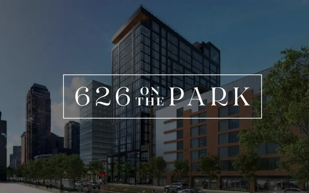
626 On The Park opened in Chicago’s South Loop with 16 floor plans and two leasing structures under one roof. Studios, two-bedrooms, and three-bedroom penthouses leased conventionally by the unit, plus fully furnished four-bedroom suites leased by the private bedroom. Three audiences to serve at once: young professionals, families, and students. And no prior-year traffic to learn from, because the building was brand new.

Three decisions shaped the page.

Segment the way renters think, not the way the rent roll is organized. The filters read Studio, 2 Bed, 3 Bed Penthouse, and 4 Bed (Per Bed). That last one names the leasing model in the filter itself, so a renter self-sorts before they ever see a price.

Show each plan’s price in its native format. Conventional homes show full-unit rates. Co-living suites show per-bedroom rates. No conversion math, no asterisk, no “starting at” that quietly means something different two rows down.

Put the action on the plan. Every floor plan carries its own Schedule a Tour and Lease Now. A renter who has found their home never has to back out to a generic contact form and re-explain what they already told you by clicking.


the results tell us it worked.

The floor plan pages carried the traffic. The six most-viewed layouts drew more than 3,000 views between them.

The mix is the part worth sitting with. Four conventional layouts and one per-bed co-living plan all landed in the top five. Both products found their audience on the same page, in the same reporting period, and neither one buried the other.

Downstream, that engagement produced 1,068 guest cards, 215 account creations, 159 completed applications, 100 click-to-calls, and 58 tour requests from 47,859 new users, 75% of whom arrived on a phone. The property is 44% pre-leased with lease-up still in motion.


3 questions for your own floor-plan page.

1. Does the filter name your leasing model? If any part of your building leases by the bed, the words “per bed” belong in the filter, not in a footnote under the price.

2. Can a renter tell whose price they’re looking at in under two seconds? Read your own page as someone who wants one bedroom. Then read it again as a family of four. If either has to do arithmetic, you are losing them.

3. How far is the action from the decision? Count the clicks between “this is my apartment” and a form. Every one of them is a place to lose a lease.


what we’re getting at is…

A floor plan page is the conversion point of the entire property. On mobile, where three-quarters of this audience arrived, it is often the only page that gets read properly at all.

If your building leases more than one way, a template that assumes otherwise isn’t a design compromise. It’s a leak.

Click to read the full 626 On The Park case study →

 

across industries, one thing is changing: buyers want fewer steps.

across industries, one thing is changing: buyers want fewer steps.

Order a coffee before you’ve walked in the door. Book a flight in three taps. Buy a car without ever setting foot on a lot. The common thread across every industry we work in is a shrinking tolerance for friction. Prospects have decided that steps are optional, and they’re taking their attention to whoever agrees.

Real estate — multifamily, student housing, senior living — is not exempt from this shift. If anything, the industry is more exposed to it than most, because leasing has historically been built on steps: contact forms, callbacks, in-person tours, “someone will reach out within 24 hours.” Every one of those steps used to signal a serious, high-touch process. Today, each one is a chance for a prospect to close the tab and check out the next community on their list.

the new baseline is a few clicks to a decision.

For years, the industry treated “having a website with photos and a contact form” as the finish line. But putting a floor plan online doesn’t remove friction if a prospect still has to fill out a form, wait for a callback, schedule a tour, and wait again before they know availability or pricing. That’s still a multi-day process. It’s just a digital front door on the same long hallway.

The communities pulling ahead aren’t necessarily the ones with the flashiest renderings. They’re the ones that looked at their existing leasing journey and asked a harder question: which of these steps actually needs a human before the prospect can act? Real-time availability instead of “call for pricing.” Self-scheduled tours instead of waiting on a leasing agent’s callback. One application instead of a PDF to download, print, scan, and email back.

why this matters more in real estate than most industries.

A retailer can win back an abandoned cart with a discount code. A leasing team rarely gets that second chance. A prospect who bails on a lengthy inquiry form doesn’t usually come back to finish it. They move on to the next listing, often literally in the next open tab. And with student housing and senior living in particular, decision windows are short and compressed around a season, so every extra step can cost the whole cycle.

Convenience is also doing double duty here: a community that makes touring and applying effortless is, whether it intends to or not, making a statement about what living there will actually be like day to day.

where to start looking for steps to cut.

You don’t need a full platform overhaul to make progress. A few places worth auditing first:

  • Inquiry forms. Every field you ask for before a prospect gets any real information back is a tax on their patience. Which fields could wait until after they’ve seen pricing or availability?
  • Tour scheduling. Anywhere a prospect has to wait for a callback to book a tour is a step they don’t control. Prospects increasingly won’t wait on steps they can’t control.
  • Pricing and availability visibility. “Contact us for pricing” reads as a step now, not as exclusivity. Every day a floor plan’s real price is hidden is a day a prospect can’t move forward without you.
  • Application handoffs. Any place a prospect has to re-enter information they already gave you, moving from a tour request to an application, for example, is a step you’re asking them to take twice.

    fewer steps is a positioning strategy.

    It’s tempting to file “reduce friction” under website or ops improvements and move on. But for communities competing for the same pool of prospects across multiple listing sites, ease of the process is becoming a message worth marketing directly, right alongside amenities and location. The communities that can credibly say “you can tour and apply here in one visit” are turning an operational decision into a competitive claim.

    Threshold works with multifamily, student housing, and senior living communities to close the gap between what prospects expect and what their leasing journey actually delivers. Fom the marketing that gets someone to click, to the process after they do. If you’re evaluating where you’re losing prospects to friction, we’re happy to talk through it.