
by threshold | Jul 23, 2026 | Digital Marketing, Marketing
You have seen the numbers for a grand opening. The massive spend on digital ads, the temporary signage, and the high-energy events are designed to get those first leases signed. It is a sprint to the finish line, and the momentum is intoxicating. But what happens once the building hits 95 percent occupancy? Too often, the marketing budget for those residents drops to zero. We call the work that happens after move-in the Invisible Lease-Up, and it is the most profitable strategy you are probably ignoring.
the hidden math of multifamily tenant retention marketing.
Every time a resident hands back their keys, your bottom line takes a hit that goes far beyond a few weeks of lost rent. You are looking at turnover costs like repainting, deep cleaning, and potential floorboard repairs. Then there is the cost of finding someone new: the marketing spend to get a lead, the time your leasing team spends on tours, and the administrative burden of a new application.
When you compare the cost of a renewal to the cost of a new lease, the winner is clear. Apartment renewal strategies are not just about being nice to people. They are about protecting your Net Operating Income. By shifting a portion of your lead generation budget toward the people who already live in your community, you are investing in a much higher return.
marketing to the neighbors you already have.
The biggest mistake in property management is treating retention like a 60-day window. If the first time a resident feels “marketed to” is when their renewal notice hits their inbox, you have already lost. True resident loyalty programs are built on a year-round connection that makes the decision to stay feel like the only logical choice.
physical touchpoints that create community.
In a world of digital noise, physical items still carry immense weight. High-quality branded apparel or thoughtful move-in gifts do more than just put a logo in someone’s hands. They create a sense of belonging. When a resident wears a high-end hoodie with your property’s branding or uses a premium coffee tumbler provided by the leasing office, they aren’t just a tenant. They are part of a club. These small investments in the ROI of resident experience pay off every time a resident chooses to stay another year.
communication beyond the maintenance request.
Most residents only hear from the office when there is a problem or a bill. You can change that dynamic by using your digital platforms to highlight the lifestyle your community provides. Share news about a new local coffee shop, host a quick social media contest, or send out a monthly update that focuses on the neighborhood. It keeps your brand top of mind positively, rather than a purely transactional one.
making loyalty part of your property management marketing plan.
A successful retention strategy requires the same level of creative thinking and data tracking as your lead generation. You need to know which amenities people actually use and which events get the best turnout. This data allows you to tailor your outreach so it feels personal rather than automated. People don’t leave communities where they feel seen and valued.
the retention advantage:
- lower vacancy loss and turnover expenses
- reduced pressure on the leasing team to find new leads
- higher quality online reviews from long-term residents
- a stable, predictable community culture
Focusing on the Invisible Lease-Up does not mean you stop looking for new residents. It means you stop treating your current ones as finished projects. When you treat a renewal with the same level of excitement as a new move-in, your residents notice. And more importantly, your bank account notices too.
At Threshold, we know that your marketing needs to do more than fill units. It needs to keep them full. Whether you need high-end promotional products to wow your residents or a digital strategy that keeps your community engaged, we are here to help you win the long game. Need a partner who can handle the creative, the logistics, and the strategy all at once? Yep, we can do that.
by threshold | Jan 25, 2022 | Creative, Design, General, Marketing, Thought Leadership
Written by Kathy Jones, Agency Operations Manager
With an ever changing real estate industry, developing a real estate marketing plan informed by strategic thinking is absolutely essential to be able to stand out from your competitors. When it comes to your print marketing strategy, you may feel that your number one goal is to create the perfect flyer or brochure that your team can distribute in high traffic areas. However, what happens next when the prospect receives and reads the flyer is oftentimes an afterthought. In reality, it takes careful consideration of the full leasing/sales journey to create print assets that really make an impact on your prospects.
While COVID-19 brought a large decrease in the number of prospects touring leasing offices and sales centers in person, that number is quickly on the rise again and so is print marketing. Since the real estate industry is quickly changing, your strategic plan should also be changing. Your vision will likely remain the same but your goals should be frequently reviewed. For most clients to the real estate industry, the enduring vision is to impact your bottom line (e.g. improving occupancy rates or increasing revenue), but you can’t get there unless you set more specific, granular goals along the way. For example, one goal might be to increase the number of leases or sales contracts that are signed each month. In order for you to achieve that goal, you need to build a hand-crafted strategy that will push prospects into your leasing office or sales center to close the deal.

Every community is different. One might have a great location where others might have strong brand awareness in their market. If your community is located in a great location, guerilla marketing can be a great supplement to your existing digital marketing. But what happens once your prospect receives your flyer? The prospect will likely view your website and head into your leasing office or sales center for a tour.
Furthermore, your strategic plan shouldn’t end once the prospect walks through the door. A well thought out tour is your next step. In what order should property information be presented to your prospect? In most cases, this is the order of operations that yields the best results:
- Property overview
- Apartment amenities
- Community amenities
- Property location
- Floor plan types
This gives prospects the ability to get to know your property and hopefully be wowed by amenities so they’re already picturing themselves living in your community and exploring the local neighborhood by the time you get down to the specifics of floor plan options. This makes many prospects eager to lock down a specific floor plan as you broach this subject with them during your tour.

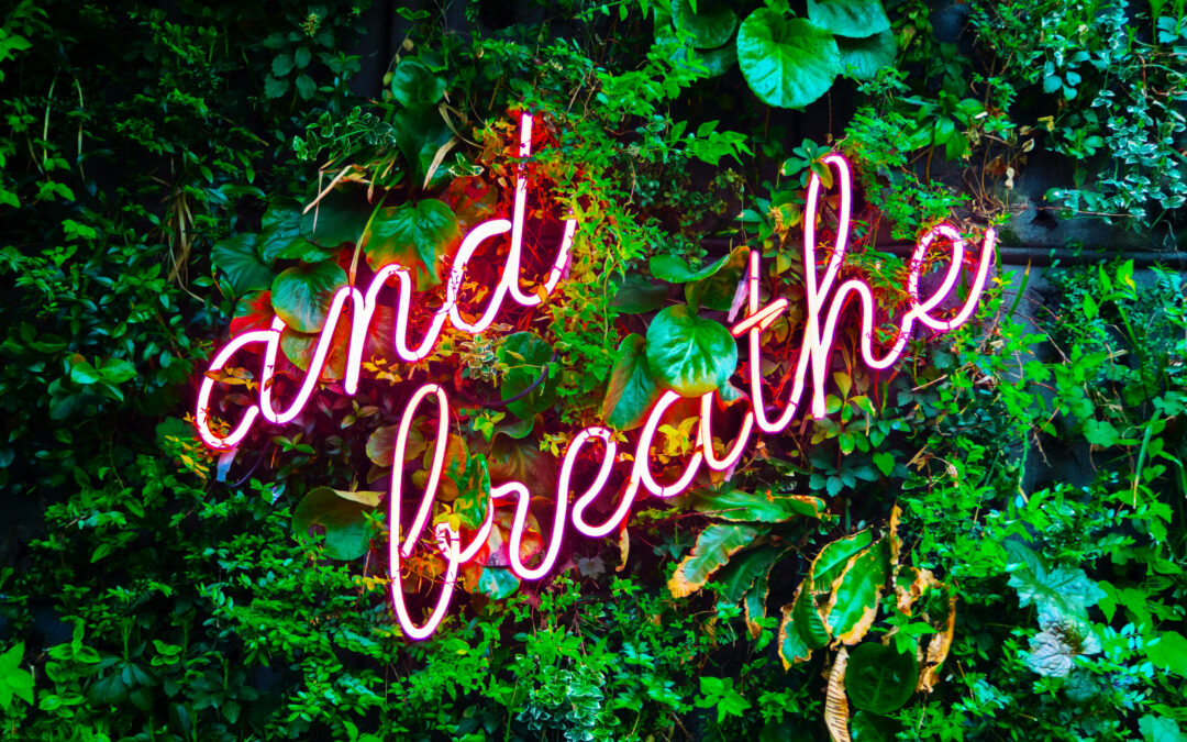
Leasing offices and sales centers are likely your last chance to wow your prospect and can make or break your prospect’s likelihood of signing a lease. You may have a well thought out strategy to get them in the office and a tour strategy that piques their interest, but what is really going to make you stand out from the crowd? Creating an experience that will resonate is key, so environmental graphics within your leasing/sales center are important factors in sealing the deal. Living green walls, Instagram walls with neon signs, or custom corkboards where you can add photos of prospects signing are all unique ways to achieve that wow factor. If you stay on top of trends, you won’t be surprised. In fact, you’ll be far ahead of others because you’ll have had years to strategize and adapt, so that when disruption hits, you not only have a plan, but are already implementing it.
by threshold | Sep 22, 2020 | Creative, Design, Digital Marketing, Marketing, Tech/Web, Thought Leadership
Every good digital marketing plan for real estate must take into account the user experience on property websites. After all, a digital ad is only as good as the landing page it directs to, and a bad first impression can destroy your chances with a prospect. Real estate marketers today know they need to provide a great user experience on property websites, but they aren’t always sure how to improve UX or use strong UX design from the beginning.
If this sounds like you, don’t worry, we’re going to go through some UX tips for apartment websites. These tips range from quick fixes to broader strategies, but every one of them will help you build websites that meet user’s needs and encourage them to take the actions that are important for your bottom line.
Study User Behavior
First and foremost, you need to understand your users. Not just users in general, but your users; your audience’s browsing habits, goals, needs, motivators, and preferences. Each market is different and so is each person, but a few strategies can help you discover broad habits that your site should cater towards, like what information is important to your users and what device they usually use to search for housing or access your resident portal.
Conduct a Focus Group
A focus group survey can help you understand a lot about your audience. While the best focus groups require diligent survey design, the payoff can be massive.
When conducting focus groups, make sure to get as representative a sample as possible for your city, university, or age group. You might want to offer an incentive to attract more participants—for example, with a chance to win a gift card once the survey has been completed.
Avoid asking leading questions or limiting the answers your respondents can give. Keeping things open-ended is the best way to ensure you learn something you didn’t already know (or assume).
Use Scrollmaps
Scrollmaps are a tool you can use to study user behavior on a site that already exists. It shows you where users tend to linger on a page, where they tend to click, and which areas fail to hold their attention. This is a particularly useful tool if you want to identify areas for improvement on a website you’ve already built.
Scrollmaps can’t provide a full picture, however, because they don’t show you what your users would be doing if things were different. They can only show you what they are or aren’t doing right now. In other words, they’re better at identifying problems than solutions. Still, they can be a great place to start.
Study Your Google Analytics
For more insights into user behavior on already existing sites, Google Analytics is a fantastic resource. It allows you to see which pages have the highest bounce rate or lowest time spent on-page, which pages are most viewed and which are rarely seen. These insights can help you identify sections of your site that need improvement. Combined with the use of scrollmaps, this strategy can give you a lot of information about your current UX without having to ask users directly.
Consider Your Mobile User Experience

While many users’ housing searches take place primarily online, mobile phones and tablets still represent a significant portion of the traffic to your property website. In fact, a user is especially likely to encounter your property website on their phone during the discovery phase, when they’re forming their initial opinions and deciding which properties will move forward into their consideration phase. This means having a responsive website—one that’s optimized for a variety of screen sizes—is essential in making a good first impression.
If you’re not sure how to turn a website design that’s optimized for desktop into one that works on mobile, here are a few basic guidelines.
When it comes to website design for mobile:
- Stack content vertically instead of horizontally
- Use image carousels instead of images arranged in a grid pattern
- Implement expandable elements so users can expand and collapse information as they desire
- Use an expandable “hamburger” navigation menu that remains out-of-the-way when not in use
Address Long Loading Times
Nothing contributes to high bounce rates more than a slow load time. That’s because a slowly-loading page makes for a terrible user experience in a world grown accustomed to lightning-fast internet. Users just don’t have the time or patience to wait for your site to load, especially when they have other options available to them.
The best way to reduce page load times is to be aware of the common culprits—namely, video and images. When you have several large image or video files on a page, it takes much longer to load, even on the best internet available today. It’s best to keep each image or video under 500KB wherever possible.
That’s not your only option, though. Sometimes, you might need to include a large file (or several). In cases like these, you can instead defer certain elements from loading on the page until they’re needed, or until the rest of the page loads. For example, you can wait to load a video until a user scrolls to the section of the page it’s on.
Make Pages More Engaging

The longer a user spends on a page, the likelier they are to take a conversion action or become loyal to your brand. But you need to give them reasons to stick around, and that means offering a great experience while they’re there.
One of the best ways to improve website UX by making your pages more engaging is to incorporate great images and video onto as many pages as possible. Users like to have something visual to enhance their understanding of information and hold their focus.
For apartment websites, we highly recommend taking high-quality photos and video of your community and incorporating them throughout your webpages (not just on a gallery page). Virtual tours have become a must, and your homepage can be a great place to feature a professionally edited community tour video or even feature Matterports of your top floor plans.
Make Pages More Scannable
Much as website creators might want them to, users don’t read pages from start to finish. Instead, they scan pages for the information they need or content that engages their attention.
Work with user habits and not against them by making your pages easier to scan. This creates a better user experience on your property website and improves your chances of showing a user that your community is right for them.
Tips for making web pages more scannable include:
- Develop a clear hierarchy of information by using header tags, consistent font and formatting styles, and visual cues that help signal separate chunks of information (like font color, font weight, background color, and other design elements).
- Use headers that clearly signal the content they introduce (e.g. “Community Amenities” or “Amenities for an Active Lifestyle”).
- Avoid long blocks of text. Break up text into sections of about 100 words or less.
- Avoid repetition. Repetitiveness confuses the reader about where they can find the information they’re looking for. It can also seem spammy to users and search engines alike.
- Use bullets or lists when you can (like we just did).
Make In-Demand Pages Accessible
Some pages are more important than others, and you want to make sure your users can easily find and use the pages they need the most (and the pages you most want them to use). For apartment websites, that’s typically your application portal, contact page, and resident portal. It might also be a page housing your virtual tour or floor plan availability. There are a few things you can do to make these in-demand pages more accessible.
Firstly, let’s talk about accessibility in terms of how easy it is to find. Use clear Call-To-Action buttons at the tops of pages—especially your homepage—to direct users to what they need and where you want them to go. You might also use borders and contrasting colors in your navigation menu or headers to make links to these pages clearer and more attractive.

Making pages more accessible also means making them easier to use for as many users as possible, including those with disabilities. For example, make sure you use fonts that are large enough for all users to read. You should also avoid using colors that provide poor contrast with one another, especially for text and CTA buttons.
Don’t Forget About Micro-Copy
“Micro-copy” refers to those small pieces of text that guide a user through your website, like the text on a CTA button or the error message they get when they fill out a form incorrectly. It’s easy to overlook the power of strategic micro-copy, but these are often high-impact areas that define the quality of a user’s experience in spite of their relatively small real estate.
Beyond their usefulness in guiding a user clearly through your website experience, micro-copy also offers a great opportunity to turn something generic into something that expresses your unique brand and really makes an impression on users. For example, the ubiquitous “Submit” button is boring and not all that descriptive. A button reading “Send My Message” or “Make Me a VIP” is more descriptive, personal, and flavorful.
Micro-copy applies to areas like CTAs and form fills but can also include hover copy to let a user know something is clickable and what will happen when they click (e.g. on an image or button), like in the below example.

Micro-copy also allows you to set expectations for what will happen when a user does something, which makes them far more likely to take the conversion actions you want them to take. For example, if you want the user to contact you to schedule a tour or start an application, including the text “We’ll read your message thoroughly and get back to you within 24 hours,” near the contact form gives a user the confidence that taking that action will lead to their desired result.
That’s all our tips for improving UX on apartment websites! If you want to learn more about UX or get professional assistance with your UX Design, you can do so by filling out our Contact Form. We’d love to hear from you.