by threshold | Sep 23, 2026 | Creative, Digital Marketing, Tech/Web
Every leasing website has a page where the decision actually happens. It isn’t the homepage. It isn’t the amenities gallery, however good the photography is. It’s the floor plan page. The moment a renter stops browsing a building and starts pricing a specific home for themselves.
Most floor plan pages are built for exactly one kind of renter. That used to be fine. It isn’t anymore.
two products, one page.
More properties now lease two ways at once. Conventional apartments priced by the unit sit alongside furnished suites priced by the bedroom. Co-living plans share a page with three-bedroom penthouses. By-the-bed leasing, once the preserve of student housing, keeps turning up in conventional multifamily.
Most leasing platforms haven’t caught up. They assume one pricing model and one shopper, so the property picks a lane and hopes. Show full-unit rates and the renter shopping a single furnished bedroom sees a number four times what they’d actually pay. Show per-bed rates and the family pricing a three-bedroom sees a figure that doesn’t cover their household.
Here’s the part that makes this expensive: the renter who sees the wrong number doesn’t ask a question. There is no form fill that says “this price confused me.” They leave, and the property never finds out why. It shows up in your analytics as an ordinary bounce, indistinguishable from someone who was never going to lease.
what we did at 626 on the park.
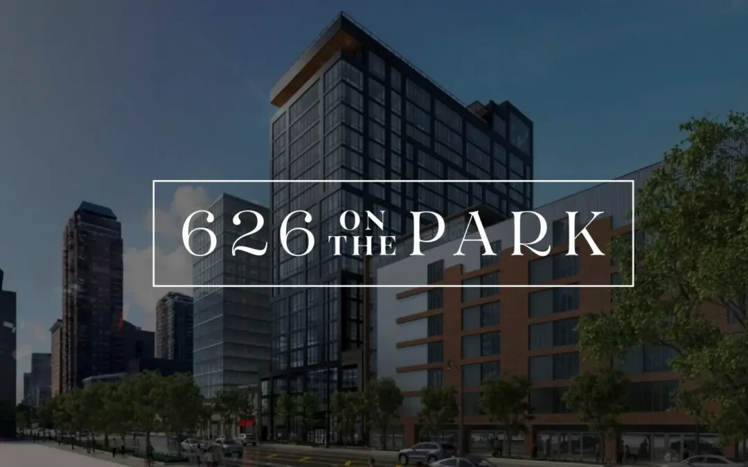
626 On The Park opened in Chicago’s South Loop with 16 floor plans and two leasing structures under one roof. Studios, two-bedrooms, and three-bedroom penthouses leased conventionally by the unit, plus fully furnished four-bedroom suites leased by the private bedroom. Three audiences to serve at once: young professionals, families, and students. And no prior-year traffic to learn from, because the building was brand new.
Three decisions shaped the page.
Segment the way renters think, not the way the rent roll is organized. The filters read Studio, 2 Bed, 3 Bed Penthouse, and 4 Bed (Per Bed). That last one names the leasing model in the filter itself, so a renter self-sorts before they ever see a price.
Show each plan’s price in its native format. Conventional homes show full-unit rates. Co-living suites show per-bedroom rates. No conversion math, no asterisk, no “starting at” that quietly means something different two rows down.
Put the action on the plan. Every floor plan carries its own Schedule a Tour and Lease Now. A renter who has found their home never has to back out to a generic contact form and re-explain what they already told you by clicking.
the results tell us it worked.
The floor plan pages carried the traffic. The six most-viewed layouts drew more than 3,000 views between them.
The mix is the part worth sitting with. Four conventional layouts and one per-bed co-living plan all landed in the top five. Both products found their audience on the same page, in the same reporting period, and neither one buried the other.
Downstream, that engagement produced 1,068 guest cards, 215 account creations, 159 completed applications, 100 click-to-calls, and 58 tour requests from 47,859 new users, 75% of whom arrived on a phone. The property is 44% pre-leased with lease-up still in motion.
3 questions for your own floor-plan page.
1. Does the filter name your leasing model? If any part of your building leases by the bed, the words “per bed” belong in the filter, not in a footnote under the price.
2. Can a renter tell whose price they’re looking at in under two seconds? Read your own page as someone who wants one bedroom. Then read it again as a family of four. If either has to do arithmetic, you are losing them.
3. How far is the action from the decision? Count the clicks between “this is my apartment” and a form. Every one of them is a place to lose a lease.
what we’re getting at is…
A floor plan page is the conversion point of the entire property. On mobile, where three-quarters of this audience arrived, it is often the only page that gets read properly at all.
If your building leases more than one way, a template that assumes otherwise isn’t a design compromise. It’s a leak.
Click to read the full 626 On The Park case study →
by threshold | Sep 15, 2026 | Digital Marketing, General, Tech/Web
Order a coffee before you’ve walked in the door. Book a flight in three taps. Buy a car without ever setting foot on a lot. The common thread across every industry we work in is a shrinking tolerance for friction. Prospects have decided that steps are optional, and they’re taking their attention to whoever agrees.
Real estate — multifamily, student housing, senior living — is not exempt from this shift. If anything, the industry is more exposed to it than most, because leasing has historically been built on steps: contact forms, callbacks, in-person tours, “someone will reach out within 24 hours.” Every one of those steps used to signal a serious, high-touch process. Today, each one is a chance for a prospect to close the tab and check out the next community on their list.
the new baseline is a few clicks to a decision.
For years, the industry treated “having a website with photos and a contact form” as the finish line. But putting a floor plan online doesn’t remove friction if a prospect still has to fill out a form, wait for a callback, schedule a tour, and wait again before they know availability or pricing. That’s still a multi-day process. It’s just a digital front door on the same long hallway.
The communities pulling ahead aren’t necessarily the ones with the flashiest renderings. They’re the ones that looked at their existing leasing journey and asked a harder question: which of these steps actually needs a human before the prospect can act? Real-time availability instead of “call for pricing.” Self-scheduled tours instead of waiting on a leasing agent’s callback. One application instead of a PDF to download, print, scan, and email back.
why this matters more in real estate than most industries.
A retailer can win back an abandoned cart with a discount code. A leasing team rarely gets that second chance. A prospect who bails on a lengthy inquiry form doesn’t usually come back to finish it. They move on to the next listing, often literally in the next open tab. And with student housing and senior living in particular, decision windows are short and compressed around a season, so every extra step can cost the whole cycle.
Convenience is also doing double duty here: a community that makes touring and applying effortless is, whether it intends to or not, making a statement about what living there will actually be like day to day.
where to start looking for steps to cut.
You don’t need a full platform overhaul to make progress. A few places worth auditing first:
- Inquiry forms. Every field you ask for before a prospect gets any real information back is a tax on their patience. Which fields could wait until after they’ve seen pricing or availability?
- Tour scheduling. Anywhere a prospect has to wait for a callback to book a tour is a step they don’t control. Prospects increasingly won’t wait on steps they can’t control.
- Pricing and availability visibility. “Contact us for pricing” reads as a step now, not as exclusivity. Every day a floor plan’s real price is hidden is a day a prospect can’t move forward without you.
- Application handoffs. Any place a prospect has to re-enter information they already gave you, moving from a tour request to an application, for example, is a step you’re asking them to take twice.
fewer steps is a positioning strategy.
It’s tempting to file “reduce friction” under website or ops improvements and move on. But for communities competing for the same pool of prospects across multiple listing sites, ease of the process is becoming a message worth marketing directly, right alongside amenities and location. The communities that can credibly say “you can tour and apply here in one visit” are turning an operational decision into a competitive claim.
Threshold works with multifamily, student housing, and senior living communities to close the gap between what prospects expect and what their leasing journey actually delivers. Fom the marketing that gets someone to click, to the process after they do. If you’re evaluating where you’re losing prospects to friction, we’re happy to talk through it.

by threshold | Jan 22, 2026 | Creative, Design, Digital Marketing, General, Marketing
When Deborah Hayes Advertising came to Threshold, the brief was clear: design a website for Maxwell Downtown Brooklyn that feels as refined and intentional as the building itself. Maxwell is a 40-story boutique-inspired residential tower in the heart of Brooklyn, where modern living blends creativity, community, and ease. The website needed to reflect that ethos while driving engagement and conversions.
the problem.
Luxury residential websites often feel corporate, overly dense, or disconnected from the lifestyle they promise. Maxwell required something different: a digital presence that feels curated rather than commercial, sophisticated without being stiff, and elevated yet approachable. The challenge was balancing strong visual storytelling with clarity, usability, and leasing performance across devices.
the dream.
We envisioned a website that doesn’t just show Maxwell’s lifestyle—it feels like it. Elegant without excess. Intentional without artifice. Distinctly Brooklyn. The goal was to translate Maxwell’s identity into a calm, editorial digital experience that invites exploration and mirrors the residence’s quiet confidence.
the strategy.
website design.
The visual concept was inspired by effortless sophistication—timeless, confident, and approachable. This guided a restrained visual language rooted in refined typography, a carefully curated color palette, and art-forward photography. Content pacing and generous white space allow the site to breathe, creating a calm browsing experience that reflects the building’s design sensibility.
website development.
User experience guided every technical decision. Clean navigation and a clear content hierarchy help visitors move seamlessly from residences to amenities to lifestyle storytelling. The responsive framework ensures a cohesive experience on desktop, tablet, and mobile. Interactive features—including an embedded virtual tour, refined animations, and real-time pricing and availability—engage visitors while maintaining simplicity. Strategically placed calls to action, such as Schedule a Tour and View Availability, support conversion goals and connect directly to the leasing process.
the results.
The Maxwell Downtown Brooklyn website delivers a sophisticated, user-first digital presence that reflects contemporary urban living—where modern luxury meets creativity, community, and ease. A strong conceptual foundation and meticulous execution elevate the brand while remaining intuitive and performance-driven. The work was recognized with a Gold Davey Award for Website Design, celebrating excellence in digital storytelling and user experience.
Read the full Maxwell Downtown Brooklyn website Case Study.
by threshold | Jun 6, 2024 | Creative, Design, Digital Marketing, General, Marketing
Yankee Mattress Company was looking for a revamp to its branding along with a new e-commerce website. They needed a more focused approach to their target market, with stronger messaging and values that elevated their branding to the same level as their high-quality mattresses.
Threshold wanted to position Yankee Mattress as more than a retail store, but an employee-owned company that’s invested in their customer’s quality of life.
our approach.
new brand positioning & naming.
Following extensive market and customer research, Threshold created two brand concepts for the client to choose from, both with a core purpose, messaging, tagline, brand voice, and visuals. Each concept brought the brand to a more modern place, differentiating it from competitors by highlighting the craftsmanship that goes into their mattresses.
a new brand look & feel.
The brand’s new messaging needed a new logo, brand guidelines, stationary, photography, apparel design, and more. We chose to design this brand with a logo font that spoke to handmade craftsmanship and a subtle mattress icon that would become a recognizable brand statement.
a killer e-commerce website.
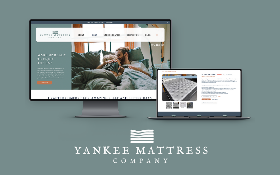
Yankee Mattress’ previous website didn’t allow for a streamlined online ordering experience. Our website design included easily navigable shopping categories as well as detailed shop pages. Each mattress product page included custom graphic designs that detailed each section of the mattress materials, making it easy for customers to browse and select the mattress best suited for them.
We designed this website to mimic the in-store experience customers have, providing them with clear information so they could make informed decisions.
we love results.
The final brand not only connects better with the target audience, but it feels timeless and elevated. Each aspect of the brand ties in seamlessly with the next, inspiring the company’s employee-owners and ensuring the quality of the mattresses is felt within the quality of the branding.
One Year Post Website Launch (April 2023-March 2024):
- 446 New Users
- 7% Increase in Engagement Rate
- A 7% Reduction in Bounce Rate
before you go.
Yankee Mattress Company can now confidently say they’re crafting comfort for amazing sleep and better days. See the case study for a full look at the transformation our THeam created for them – and what we can do for you, next.
Let’s propel you forward too! Your place for your every marketing need, with us you can go a la carte or take all the carts. Talk to a Marketing Specialist today.
by threshold | Mar 20, 2023 | General
 Ava Page
When designing (or redesigning) a custom website, there’s no denying that copywriting and design are going to be the two elements at the forefront of your mind during the creative process – but what really means more in the long run of your website’s success to gain traffic and enhance leads?
Lucky for you, we already broke it down.
What to expect from the design
It’s no secret that the main focus of website design is to accurately represent your brand’s message and image. You want to target your clients’ current and potential goals and desires – but how do you truly execute those ideas? Here are a few of our methods:
- Find the middle ground between your aesthetic, and the overall purpose of your brand
- Embrace minimalism – trying to incorporate too much in a single space will turn users away
- Create a design that speaks for itself, so your copy can focus on the product
- Tease brand design ideas by using shapes, lines, and colors that represent your overall tone
What to expect from copywriting
Although it may seem like a no-brainer, website copywriting is something that only some can do with the proper knowledge of on-site copywriting. While it’s true you want to focus your copywriting on the product(s) you’re looking to promote or sell, there’s more to it than just, “Here’s our product and what it can do.”
Here are a few of our methods:
- Keep the main focus on your products and services
- That’s what brought them there in the first place, right?
- Stick to one objective
- Bouncing around from topic to topic across your page is going to come off as scattered and unorganized
- Begin with benefits, close with features
- Research to get the best understanding of your topic
- It’s easier to break down the basics for clients and consumers when you have a full understanding
- Don’t abandon emotion for logic
- Combine both ideas into one compelling copy set
What brings the most conversions?
Data has shown that while a well-designed website is appealing to consumers, copywriting is what is really going to bring your work home and result in higher conversion rates. So, while you should never skimp on your website design, your copy should be the driving force.
Why you may ask? Website copywriting is where you’re going to be able to heighten your SEO capabilities. Don’t worry – we’ve got another blog that breaks it all down for you.
What comes first?
It’s not an uncommon practice to design a website first, and use that design to fill and create your copy. At the same time, it’s not at all uncommon to see the inverse of this process as well, which begs the question – is one more effective than the other? Let’s take a look at some of the pros and cons of each process.
Copy-First
When you choose the copy-first approach, you’re able to ultimately shape your website around your brand’s message, tone, and highlights, rather than having to write those copy points around a certain design space. Knowing what copy needs to be allocated during the design process will create a much more cohesive feel to your website. While there are many upsides to this process, there are some who see this as a downside in the overall creative process as it can add in some extra time that you may or may not have to allocate.
This isn’t to say that you can’t still create a high-conversion, visually appealing website by not following this process, whether it be for saving time or simply because it’s not the way your project management works.
Design-First
Looking in the opposite direction toward choosing a design-first approach, this process is often picked over its competitor due to its time-saving abilities. Rather than crafting around previously written copy lines, this process gives your design team full creative authority to design a stunning website that embodies exactly what your brand is about.
A downside of this process is that it can prevent you and your creative team from being able to design your website around what you’re wanting to express most in your copywriting, and would instead have to add in your copy later.
An easy way around this process would be to have your copywriter and design team work together in the creation of your site to ensure the proper areas would be included in the most efficient way for both departments.
So… is copywriting or design more important?
In terms of measuring conversions, copywriting will always be king over design when SEO strategies are correctly implemented. Luckily, we’re kind of experts in the matter.
However, this isn’t to say that you shouldn’t put the same amount of time and effort into your designs, as an attractive website will always be seen as a plus to clients, and can add a level of enjoyment when scrolling through all your (equally amazing) copy lines.
Before you go
Don’t forget, we’re experts when it comes to crafting marketing strategies that drive leasing results and building high-ranking SEO-friendly custom websites! Need help? Reach out to a CSM or any of our team members to get started on taking your marketing and SEO to the next level, see an increase in traffic, and watch the leads roll in.
For more tips and information about digital and real estate marketing, take a look at the rest of our blogs, right here on our website! You can also subscribe to our email newsletter, or follow us on Instagram, Facebook, and Twitter!